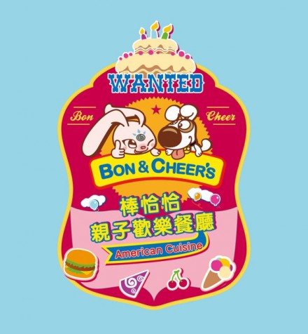
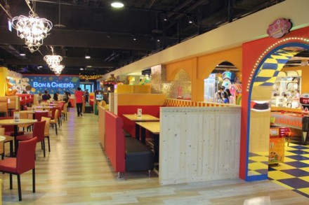
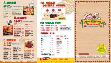
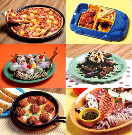
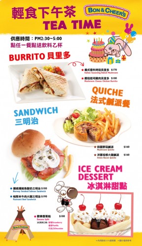
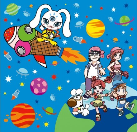
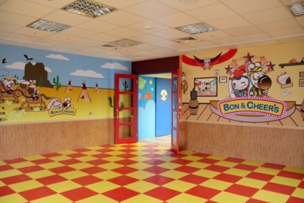
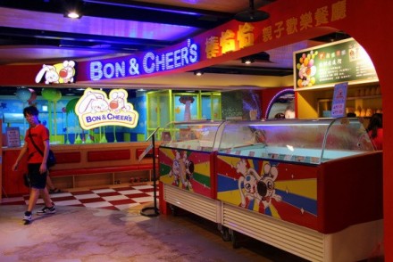
This is as good of a place as any to end the week. I mentioned in yesterday’s blog a few quick thoughts on creating restaurant branding geared toward kids. I also mentioned Chuck E. Cheese’s, an American restaurant with a carnival atmosphere completely dedicated to kids. Chuck E. Cheese’s has managed to stick around for a long time, so in that regard it’s a success, but a quick glance at the branding says they haven’t changed much over the years, at least what I can recall from my own childhood. The rise of arcades with a higher-end entertainment value–places like Dave & Buster’s comes to mind–have modernized the aim at kids and created something that most adults can enjoy as well. I routinely take my own son to a place like this and have as much fun as he does. What’s this got to do with anything? It’s with branding for kids in mind that I found this: Bon & Cheer’s, a Taiwan-based kids restaurant, heavily influenced by American restaurants of the same category but rooted in Asian culture. It’s a place with all the bells and whistles you’d expect (flashing lights, bright colors, action everywhere), but it’s the logo and visuals that I want to focus on. First, I think the name is actually really great. It works and I think it would cross cultural lines in other parts of the world should they ever choose to expand. The logo features two characters, a rabbit and a dog, who I presume are Bon and Cheer. The Asian influence is heavy here and I can see the appeal that just these two characters would create for kids. Think about places with memorable “characters”: Disney World and Chick-fil-A immediately come to mind. These characters become synonymous in the minds of children with fun and food. While I think Bon & Cheer’s has limited itself to an Asian market with the full line of branding, it’s an ambitious job whose scope is pretty expansive. Unique piece of work.

