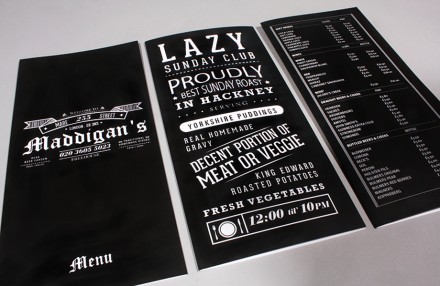
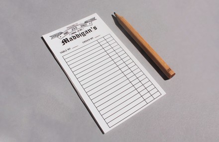
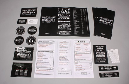
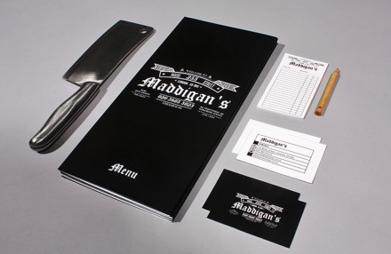
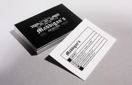
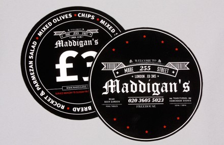
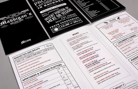
Designing the branding for a London pub is a challenging proposition because if there’s one city in the world that knows it pubs–and has plenty of them–it’s London. Aaron Kitney‘s branding job for Maddigan’s strikes a nice balance between the pub influences of old and modern accents that draw in a new customer base. Kitney’s work presents Maddigan’s as a place for the people, always a desired characteristic of a pub, with references to the famous chalkboards of many London pubs. Much of the black and white design accents this chalkboard theme all the way down to the brandmark, an exceptional and prestigious gothic piece of work. The mix of Gothic typography with more modern-leaning typography elsewhere creates a mix of old and young, a reference to Maddigan’s’ desire to draw in a wide-range of customers, especially since it’s located in the culturally-diverse Hackney neighborhood. Maddigan’s branding salutes the old school while taking a step forward into a modern age when pubs need to be a little more than just a bar to lean on and sip.

