Russian-Based Agriculture Identity

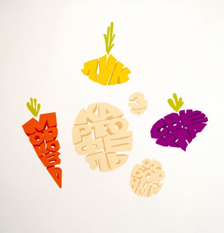
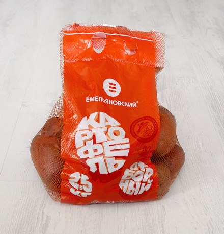
Emelyanovsky is a Russia-based agriculture center that is working to advance agriculture studies while they produce and raise vegetables, specifically potatoes, cucumbers and tomatoes. Their branding was handled by Province Studio Russia and it’s highly influenced by the tomato. The first image below is of a white plastic fork through a tomato and is essentially the inspiration for the logo. The logo resembles the three-pronged fork through the tomato and it also looks like the letter E. The color choice is a tomato red as well, a wholesome-feeling color, suitable for what Emelyanovsky does. The use of letters that spell words in the native Russia in the shape of fruits is also a playful and smart twist to further signify what Emelyanovsky’s product is really all about.

34

35

36

37

38

Discuss this Project

Leave a Reply

This site uses Akismet to reduce spam. Learn how your comment data is processed.

The Forktales Podcast™: Interviews with restaurant industry leaders and visionaries

Restaurant and advertising industry headlines and thinking

Reviews of restaurant experiences from around the globe 

Reviews of our favorite design, business, & restaurant books

Our favorite typography and fonts

Inspiration in your inbox

Get the latest inspiration in your inbox every Monday morning, for FREE!

"*" indicates required fields

This field is for validation purposes and should be left unchanged.

Delicious Bits in your Inbox!

Get the latest and greatest content delivered to your inbox for free!

"*" indicates required fields

This field is for validation purposes and should be left unchanged.