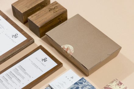
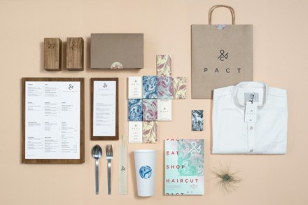
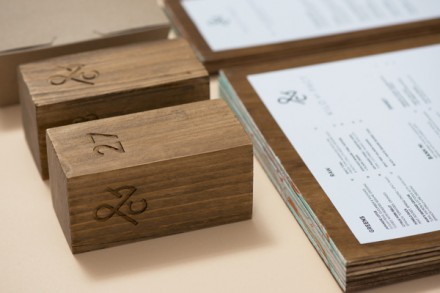
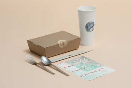
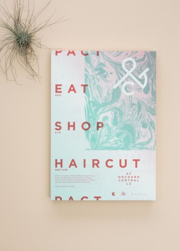
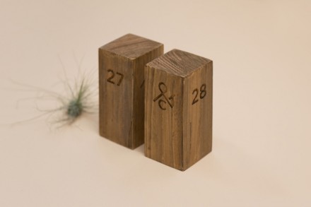
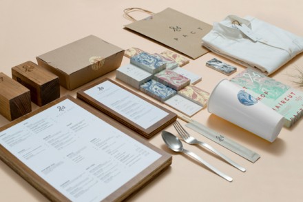
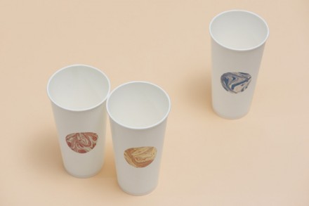
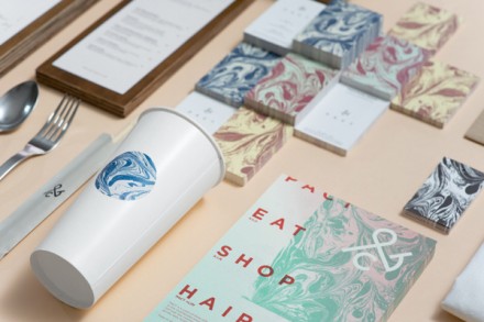
Take a road trip anywhere in the U.S. on any of the major interstates and you’ll see a great example of food brands coming together to sell their products in a single location. For every chicken sandwich drive-through and McDonald’s along the way there are shops selling pizza and tacos inside a gas station. For most dual locations the branding stays independent of each other and the only collaboration that occurs is the use of a joint space. Branding a truly collaborative shopping and dining experience, where a quantity of merchants work together to make the brand, could be a real challenging, yet inspiring, job. The design agency Acre did just this for a Singapore shopping center. The primary merchants in this location, named Pact, are salons, restaurants and clothing boutiques. The primary task for this job was to create a unifying brand for the entire center. Their visually-unique logo is a transformation of the ampersand sign (&) into a spelling of “Pact”. The & symbol is an interesting choice because it immediately implies options and choices. Acre themselves imagined it also speaking to the possibility of more shops and collaborations in the future. Marbling was chosen as the backdrop of the branding because of its infusion of colors into one beautiful haphazard pattern, a symphony of collaboration in its most natural state. It’s got an arts and crafts feel with a classy twist, perfect for the retailers and merchants in this center.


