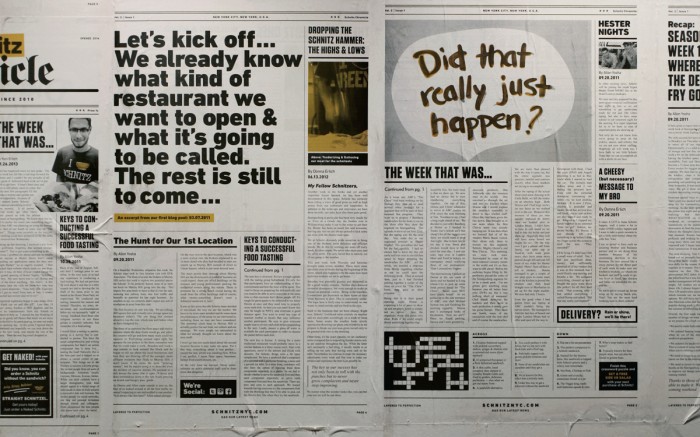
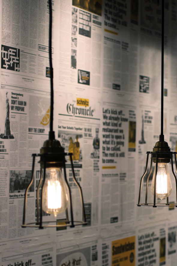
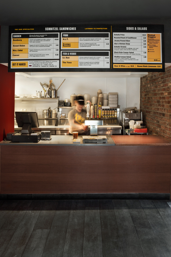
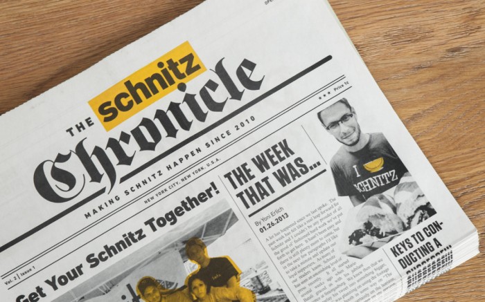
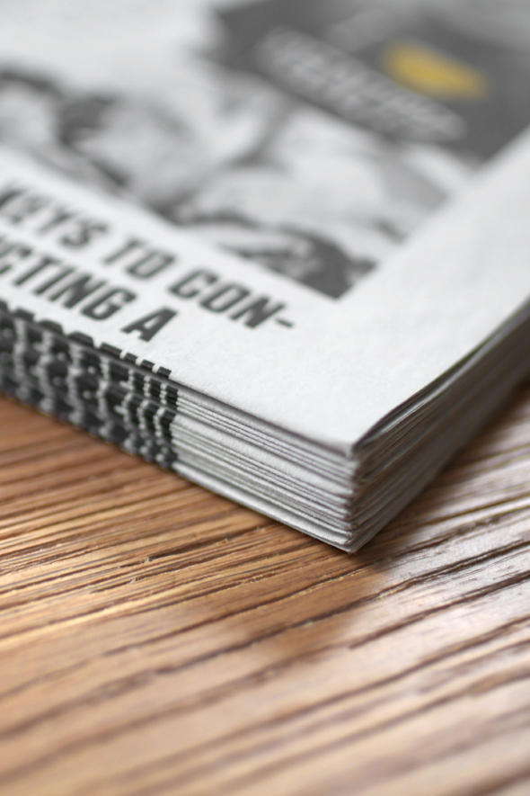
This is the latest submission from our submission form (submit your work!). What I love about this look is the urban feel of the identity. The core of the restaurant’s identity is rooted in this metro newspaper beel. It’s not oldschool newspaper, but modernized and fresh with pops of the brand color.
The rest of the graphic language is driven by strong grid and typography treatments making it super organized and simple to digest visually. Here’s what the team at Tag Collective has to say about the project:
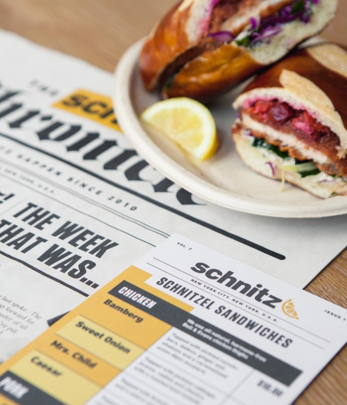
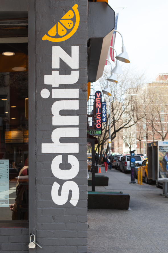
Located in New York City’s East Village, Schnitz is known for it’s irreverent and sometimes rebellious attitude. Starting out in street fairs with the biggest fryer they could fit, they began making Schnitzel sandwiches; serving each with a lemon wedge for that extra zest.
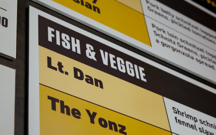
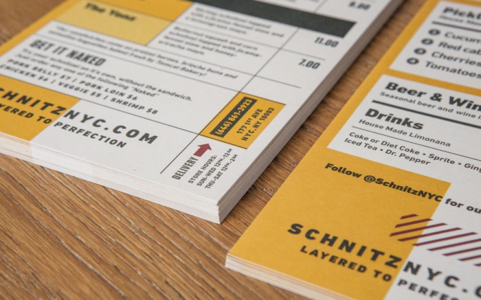
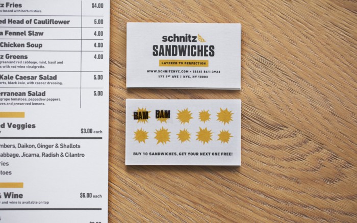
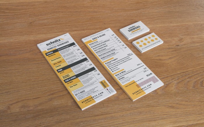
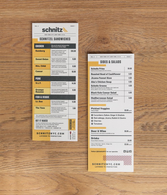
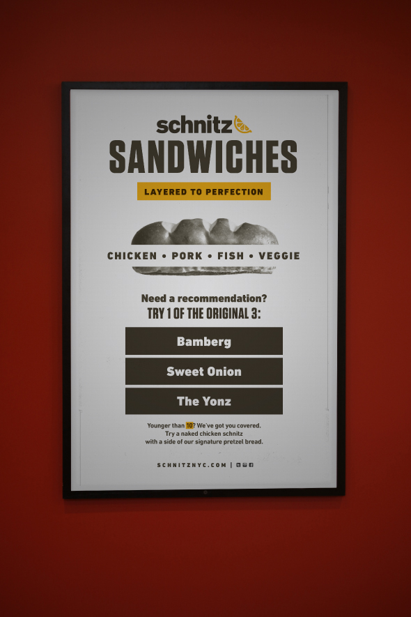
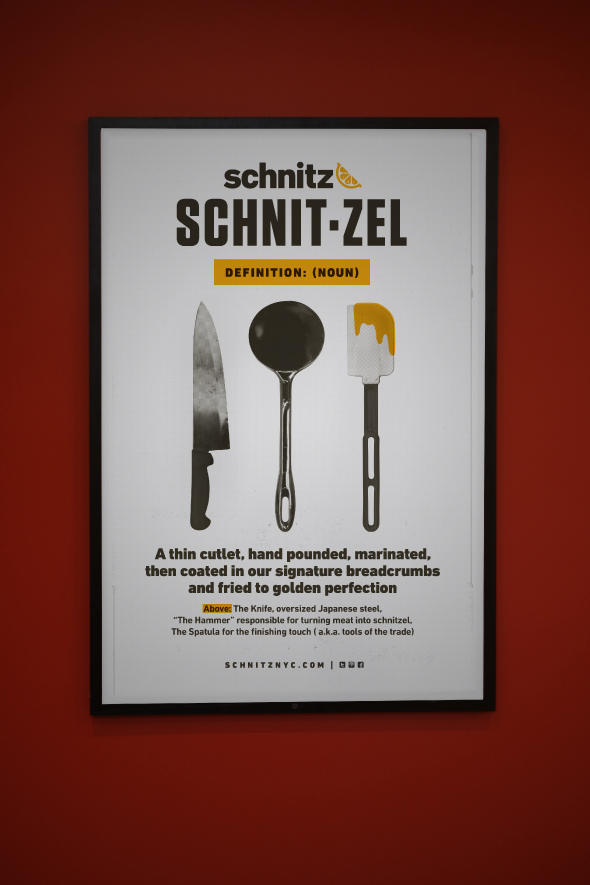
To showcase Schnitz’s history so we created a custom newspaper using their old blog posts. This served as both a promotional and hero piece within the space as custom wallpaper. The menu and printed collateral are straight forward with a little bit of playfulness, just like the food they serve. We kept the color palette very simple, using yellow and black for a high contrast punch and played off their signature sandwich garnish, the lemon.
