Seattle Cider Company branding and packaging

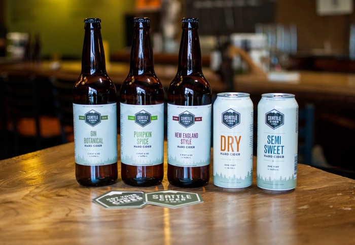
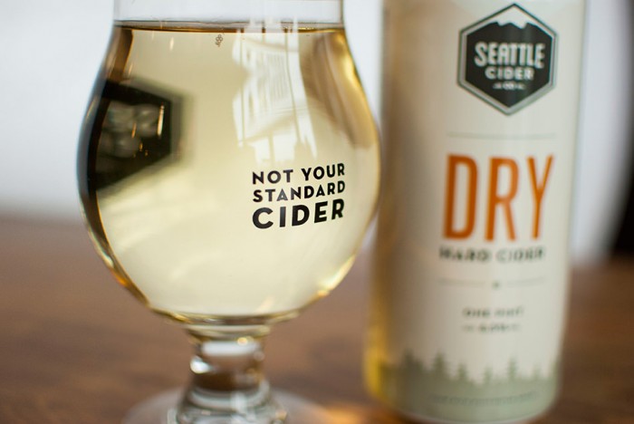
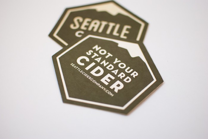
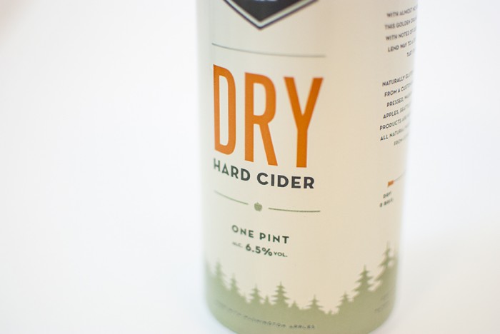
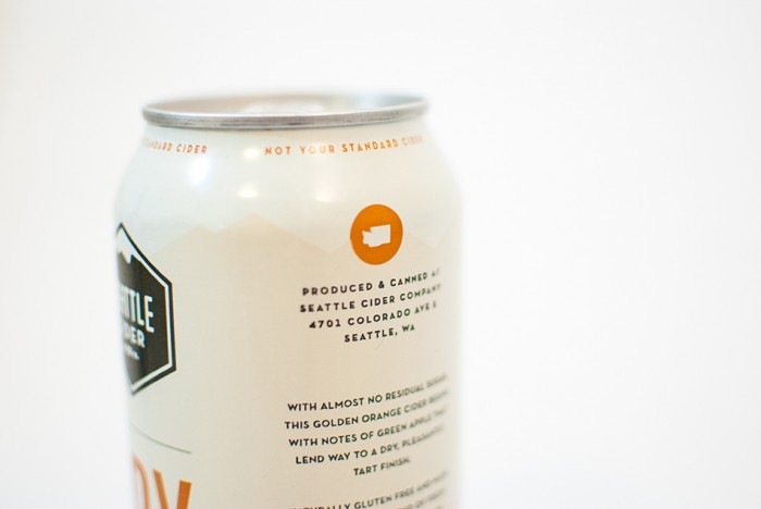
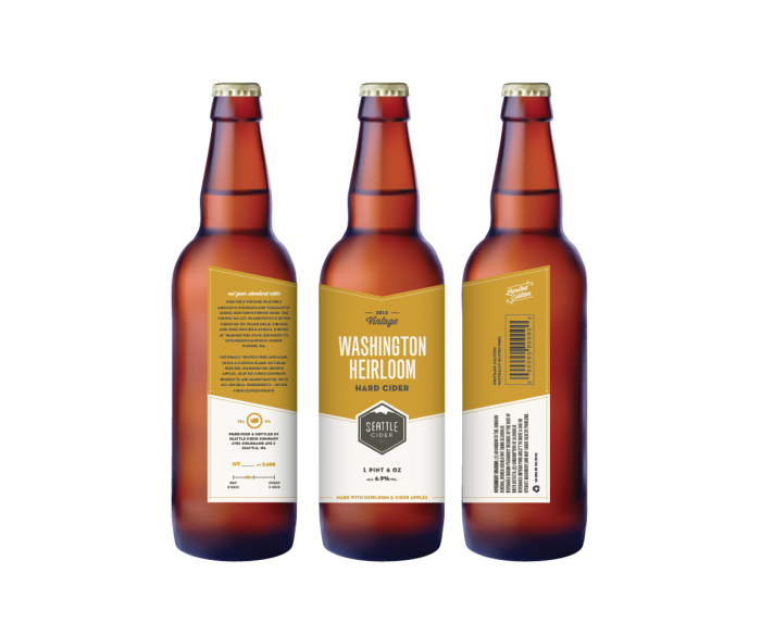
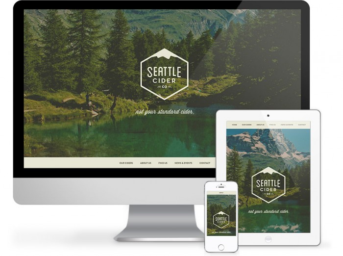
Craft beer is exploding across the nation and right behind it is the cider industry. More and more people are getting into drinking hard ciders (I’m not a fan). Seattle Cider Company is one of the latest to attempt to satiate America’s thirst. The overarching brand identity is an exercise in simplicity. Using minimal graphic treatments lets the logo and typography breath giving it visual weight. The logo is simple, but memorable using a hexagon meets mountain graphic. DEI, the design firm behind this, leverages the power of color to denote different brews. Smart use of off-white colors hints at natural without being annoyingly blatant.

TB_0019

SCC-Grid-4

SCC-Grid-3

SCC-Grid-1

SCC-Grid-2

LE_Bottle

SCC-Web

SCC-Logo-e1391556292189


Discuss this Project

Leave a Reply

This site uses Akismet to reduce spam. Learn how your comment data is processed.

The Forktales Podcast™: Interviews with restaurant industry leaders and visionaries

Restaurant and advertising industry headlines and thinking

Reviews of restaurant experiences from around the globe 

Reviews of our favorite design, business, & restaurant books

Our favorite typography and fonts

Inspiration in your inbox

Get the latest inspiration in your inbox every Monday morning, for FREE!

"*" indicates required fields

This field is for validation purposes and should be left unchanged.

Delicious Bits in your Inbox!

Get the latest and greatest content delivered to your inbox for free!

"*" indicates required fields

This field is for validation purposes and should be left unchanged.