This is the final installment of a three-part series covering Amsterdam. Part One can be found here, and part two can be found here.
Total truth: I was super excited about eating at GUTS. I think I first heard of GUTS on an episode of one of Anthony Bourdain’s shows when the restaurant was called Guts & Glory, but I could very well be imagining it. Either way, this was the first, and only, reservation I made before coming to Amsterdam, and it was the one I was most excited to experience. After a long day of soaking in the beauty of Van Gogh work, including his famous sunflowers, and shuffling through the Moco Museum to get some eyes on the work of anti-capitalist/artist Banksy, I was ready to dive into all that GUTS had to offer.
GUTS / Executive Chef/Owner Guillaume de Beer / Chef Pépé Topper
Utrechtsestraat 6, 1017 VN / Amsterdam, Netherlands / +31 20 362 0030
www.bredagroup-amsterdam.com/guts
The Food
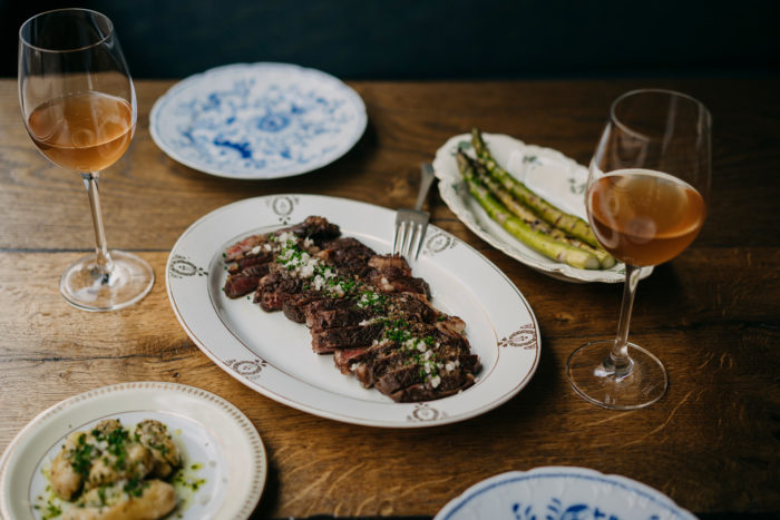
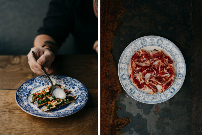
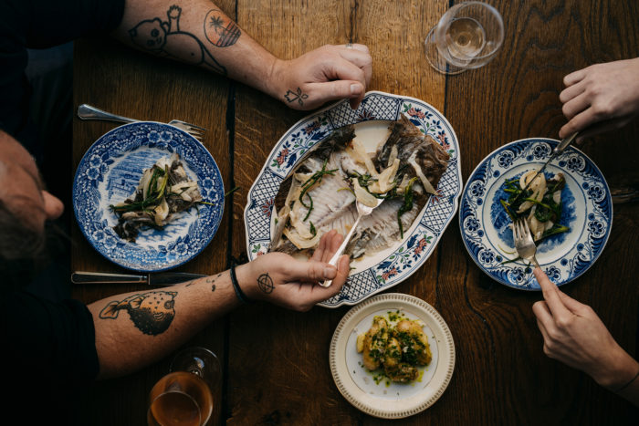
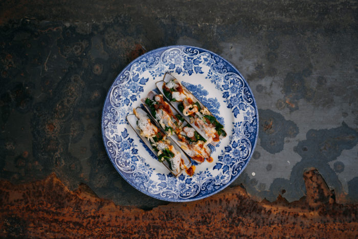
We decided to go with the wine pairing recommendations for each course which was a fantastic choice. Starting from the amuse course, the restaurant lived up to its name. The food was a wonderful exploration of local, seasonally ripe delights, brought to life with a mix of classic and daring. The first course was delicious, but I felt a little chaotic with three plates. I understand the desire to showcase the charcuterie in all its glory, but it came across as needing more thought. Beyond that course, everything else was fantastically crafted and developed. I do think the strength of the other courses accentuated the lackluster first course. However, if this is the only criticism (and it is) that’s saying a lot about the experience at GUTS.
The Interiors
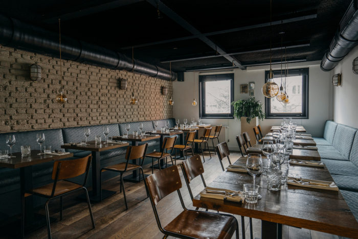
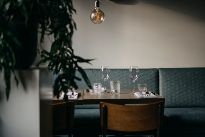
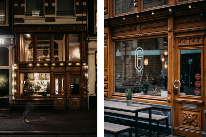
Walking up to Guts one is met with an unassuming, yet inviting, façade. Through the front door is an immediate view of a hustling kitchen and a smiling face. We were promptly seated upstairs which had a dimly lit, warm vibe. The space felt rustic yet urbane which set the feel for the overall experience. The tables are arranged in close proximity creating a sense of community without being overly intrusive in personal space.
Architect/Interior Designer / Erik Koijen
The Brand
GUTS’ “G” letterform is absolutely iconic. It serves as a statement about the precision of the cuisine and experience. It’s reminiscent of a paperclip–sharp and strong. The simple, strong nature of the identity speaks to the precision in the kitchen and the beautifully clean flavors on the plate.
Beyond the logo and menu systems there were very little elements in what would be considered the identity. And I do think there are plenty of opportunities. The plating at GUTS sets a visual tone that could and should be explored in other touchpoints like menus and even uniforms. That beautiful, iconic indigo floral print is indicative of classic Dutch aesthetics. Yet, it’s not pulled into anything else throughout the space. I would love to see inspiration taken from this to develop multiple touchpoints that tie the experience together from a visual standpoint.
Identity / Natascha Heemskerk @ Breda Group’s HQ
Notes
- Photography by Chantal Arnts


