
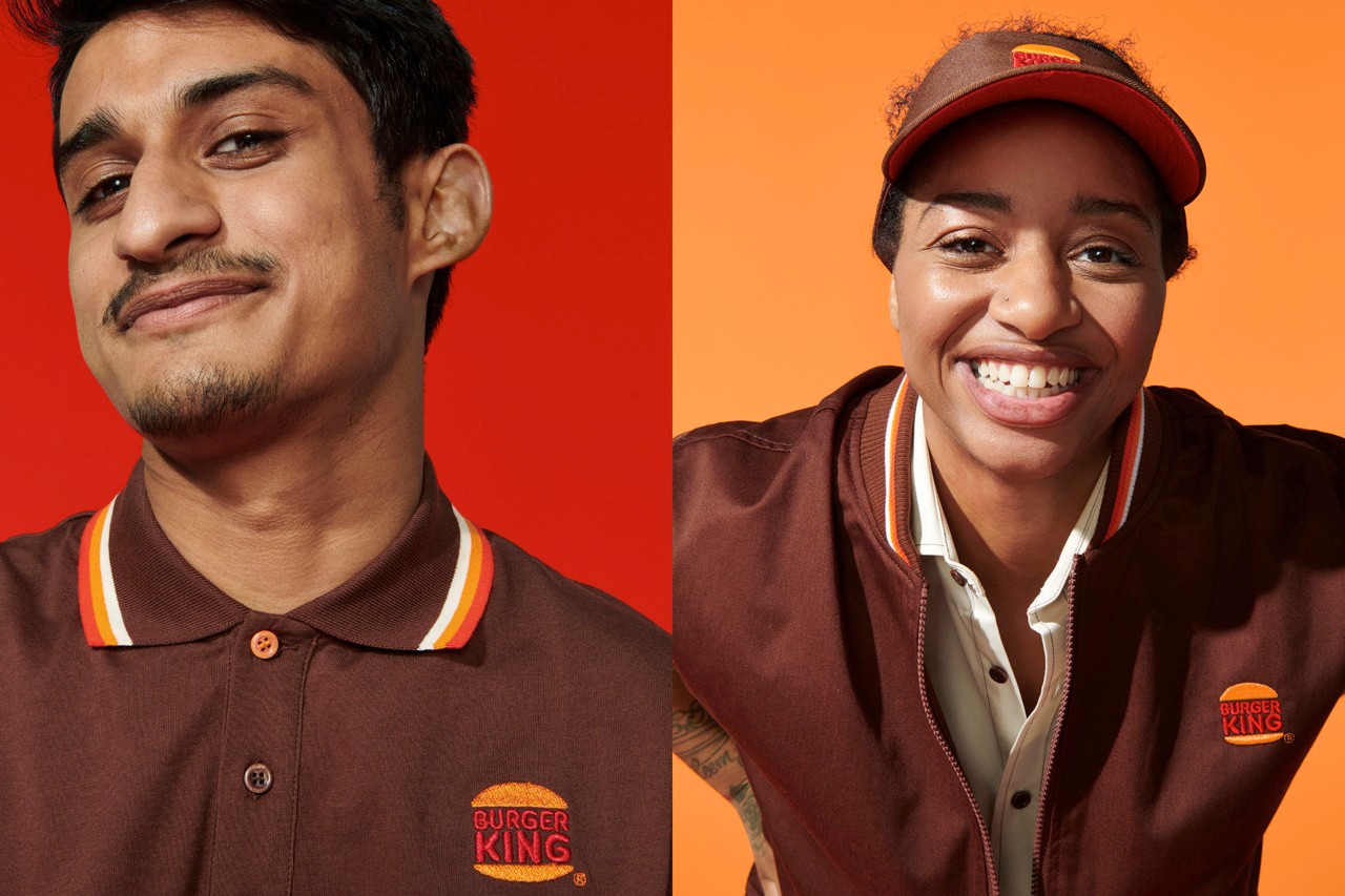
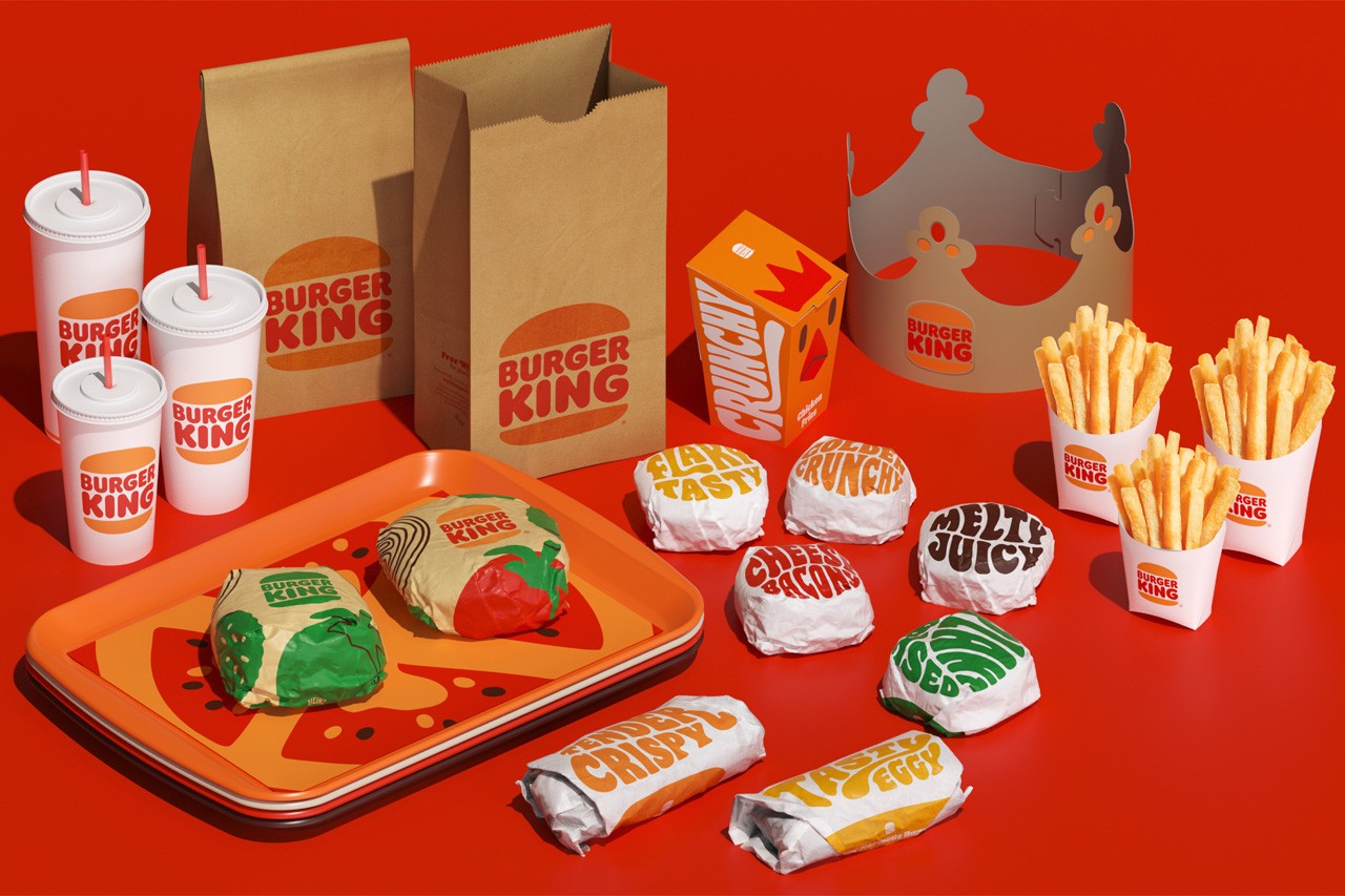
Perhaps one of the boldest moves at the beginning of this year was Burger King’s drop of their new, completely redesigned visual identity and experience.
Burger King successfully throws it back old school with a rejuvenation of their original logo, then takes it further with a fantastically designed prototype design, advertising campaign, and fully realized identity.
Designed by Jones Knowles Ritchie, an agency powerhouse for restaurant design and rebranding, the new brand identity brings a breath of fresh air to the world with hits whimsical illustrations, chunky typography, and upbeat vibes. And let’s be honest, the brand’s incumbent look had long since lost its relevance with its swooshes from the 90s.
Illustrations by Cachet Jack
“Design is one of the most essential tools we have for communicating who we are and what we value, and it plays a vital role in creating desire for our food and maximizing guests’ experience,” said Raphael Abreu, head of design at Burger King’s parent company Restaurant Brands International, in a statement. “We wanted to use design to get people to crave our food; its flame-grilling perfection and above all, its taste.”
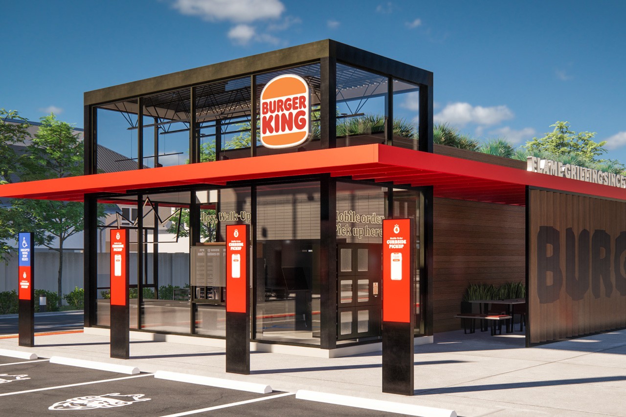
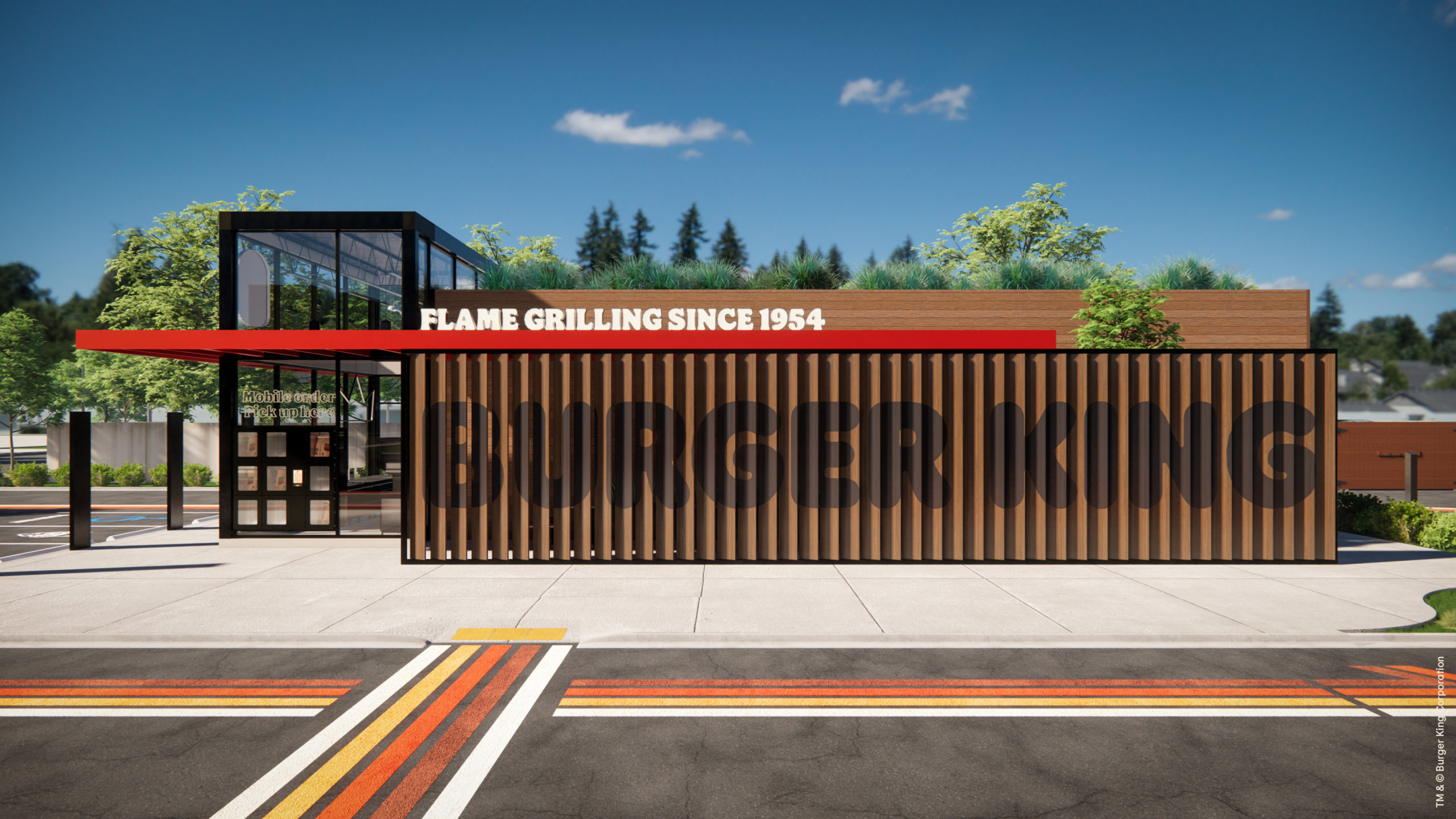
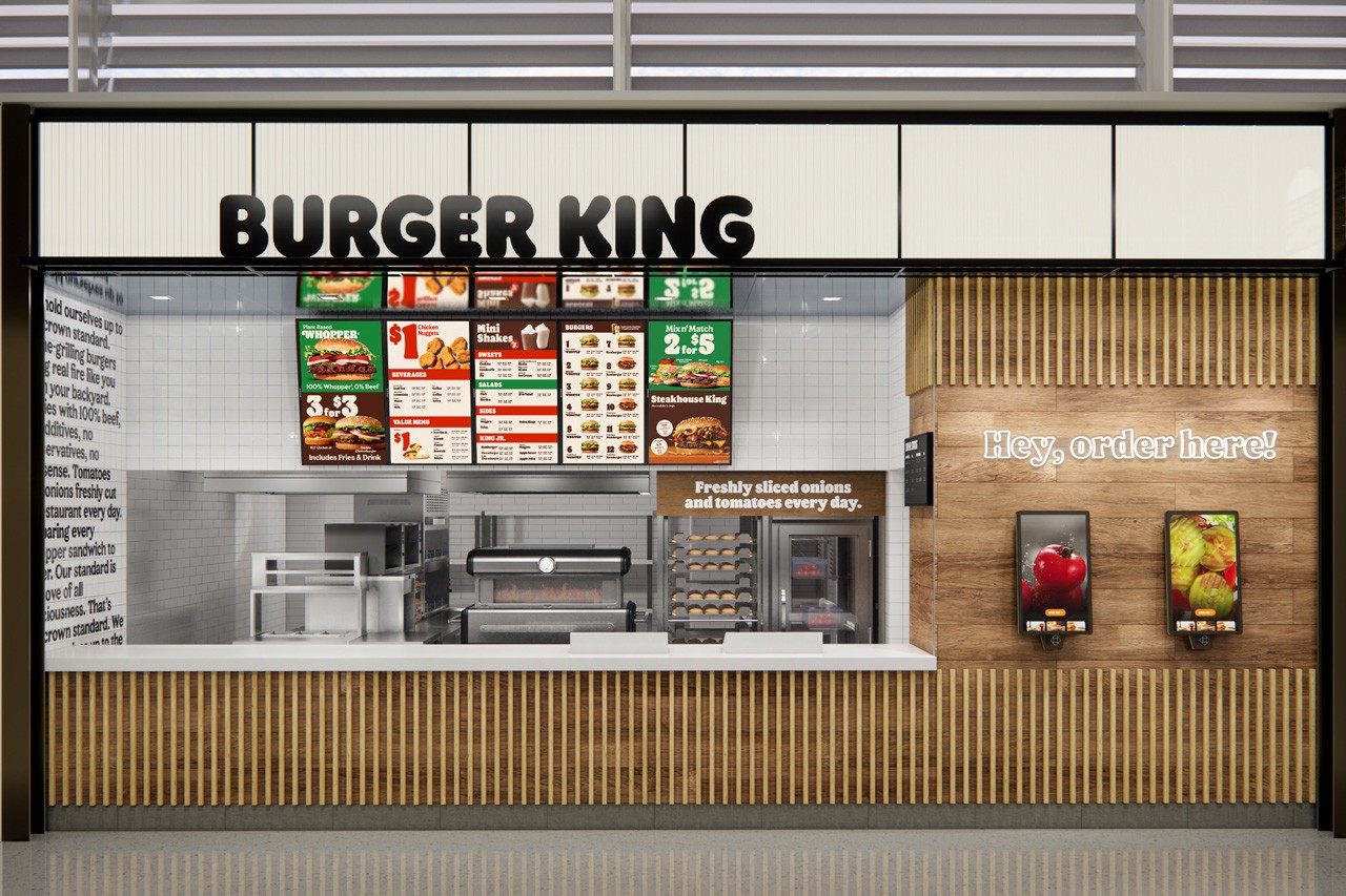
Beyond the identity there is the modernization of the Burger King store prototype. It’s remarkable upon first glance, and gets even more remarkable as one unfolds the nuances and features of the design.
Like many other restaurant brands, BK has reacted well to the behavioral shifts motivated by the pandemic. There are clear lanes for picking up orders that have been placed ahead of time via their app. The drive-through is optimized for through-put. And on the interior, they have a means to avoid human interaction, or at least minimize it, with clean, simple ordering stations.
What’s more striking to me is the perceived modularity of the building itself. The prototype design looks primed to be reconfigured for the various footprints the brand’s franchisees encounter. Additionally, it seems it can easily be adapted to existing footprints from a cosmetic standpoint.
There is so much to love about this new look and I’m sure you’re drooling just as much as I am. However, I do want to call out some criticisms because… well… that’s what we do here.
While this new identity is so much fun and absolutely lovely to look at, I cannot help but wonder how much staying power it really has. Put bluntly, this is less of a movement forward as it is a movement back to a winning path. It’s a throwback, but a strong one. So my worry is, when the glitz and glamour and newness of this rebrand wears off, we’re left with a dated look. Sure, it’ll make a big splash right now, but how will the drab browns and retro warm colors wear on? Will it morph from a kitschy moment to something that has legs?
More importantly, will other agencies be able to take this starting point and develop advertising and marketing initiatives that successfully build the look from month to month and year to year? The answer to the question isn’t necessarily an indicator of whether or not this rebrand is deemed successful, but it’s an important question to ask and ponder.


