Spanoudis Winery branding by Cursor Design

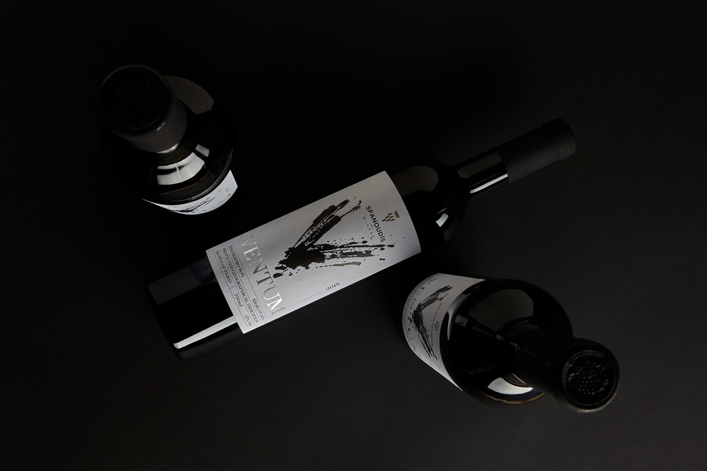
High contrast black and white design aesthetics are always so refreshing to me. There exists a certain level of confidence and refinement that comes through on subliminal layers just by employing those monochromatics. They allow finishing techniques and materials to absolutely shine through in all their glory. And that is what drew my eye to the branding and packaging work for Spanoulis Winery by Cursor Design.

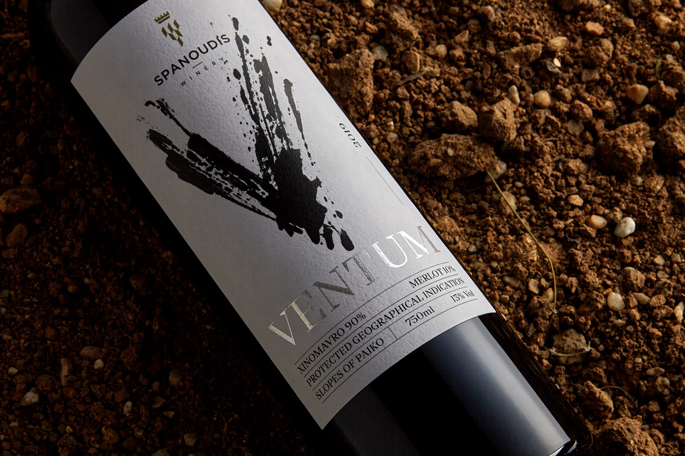
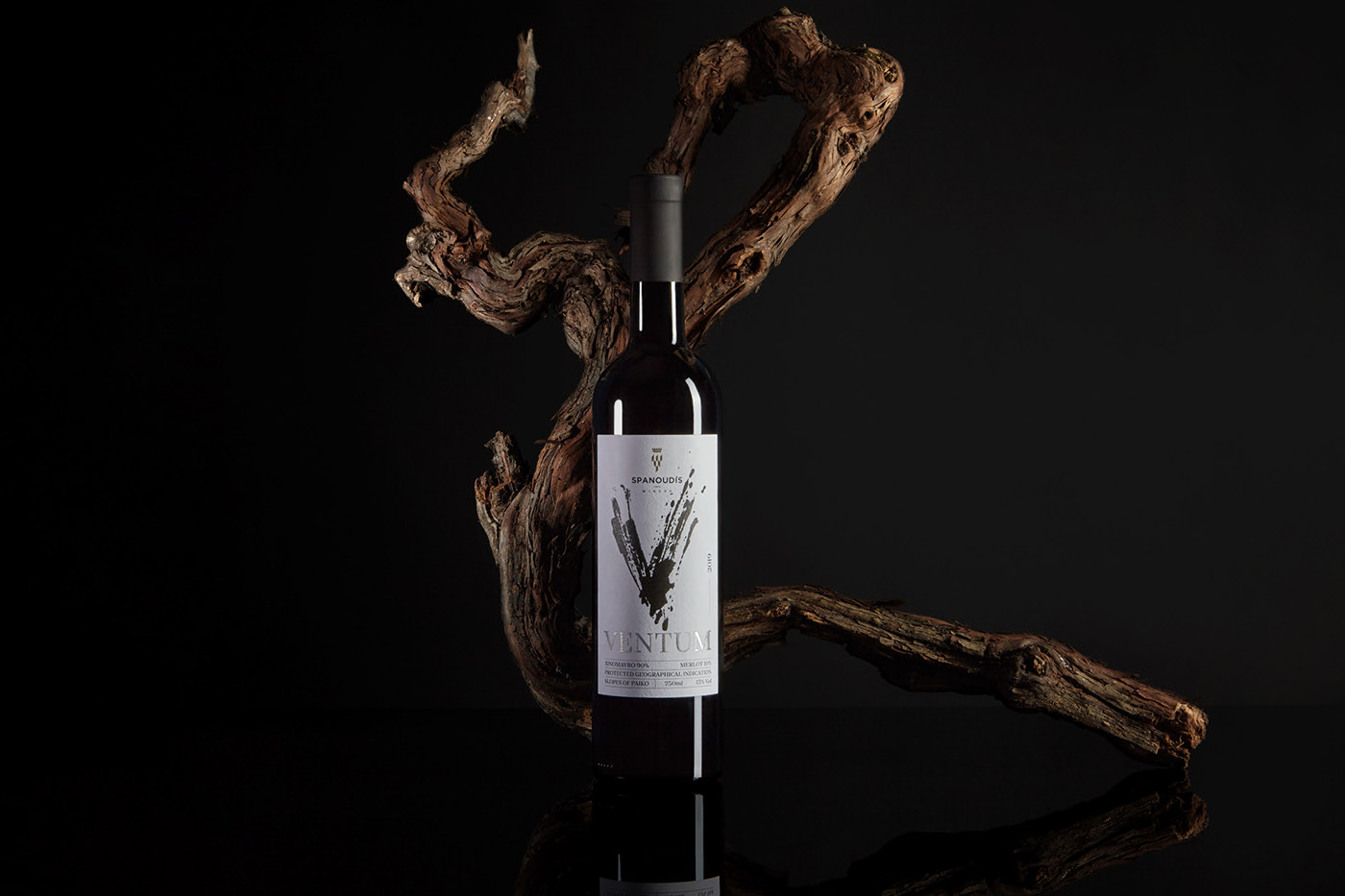
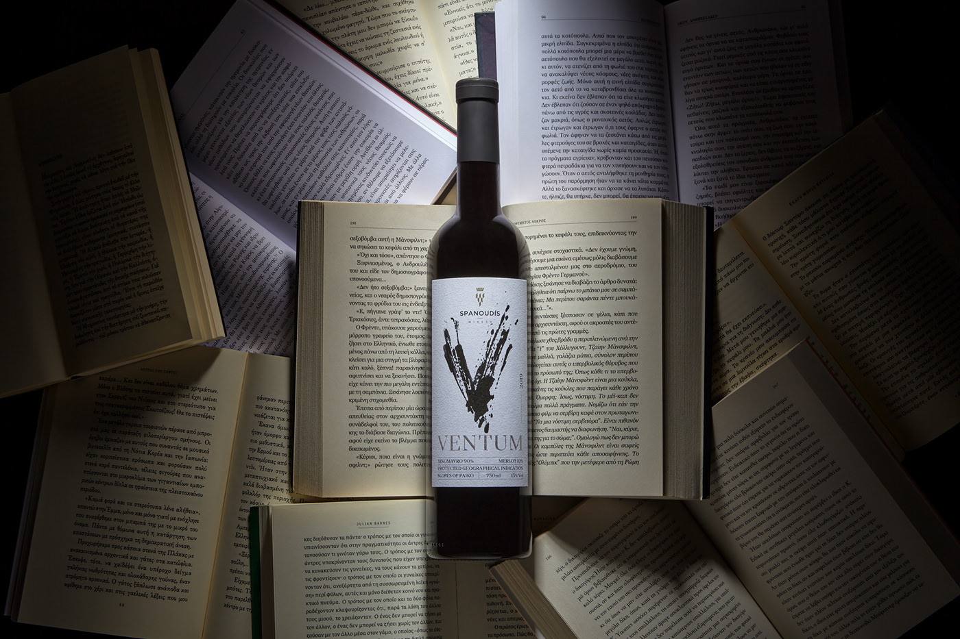
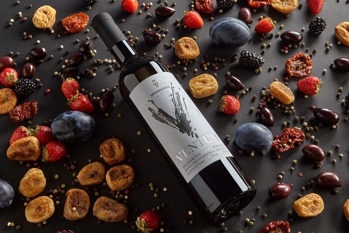
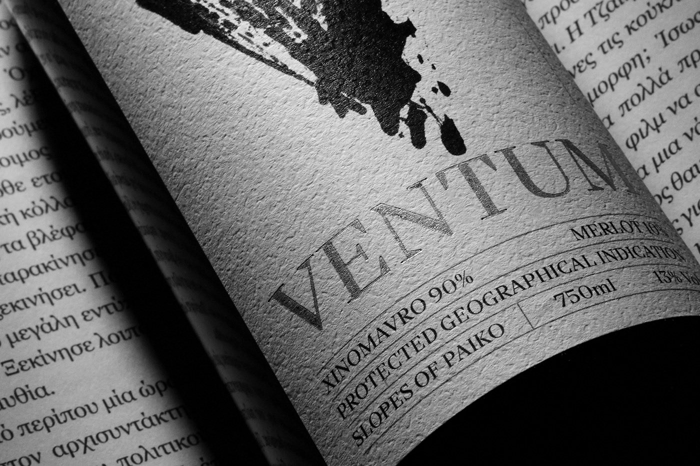
Spearheaded by a splatter-brush style “V”, the winery’s Ventum wine packaging demands attention. It’s supported by a beautiful lustrous silver logotype that creates a strong statement.

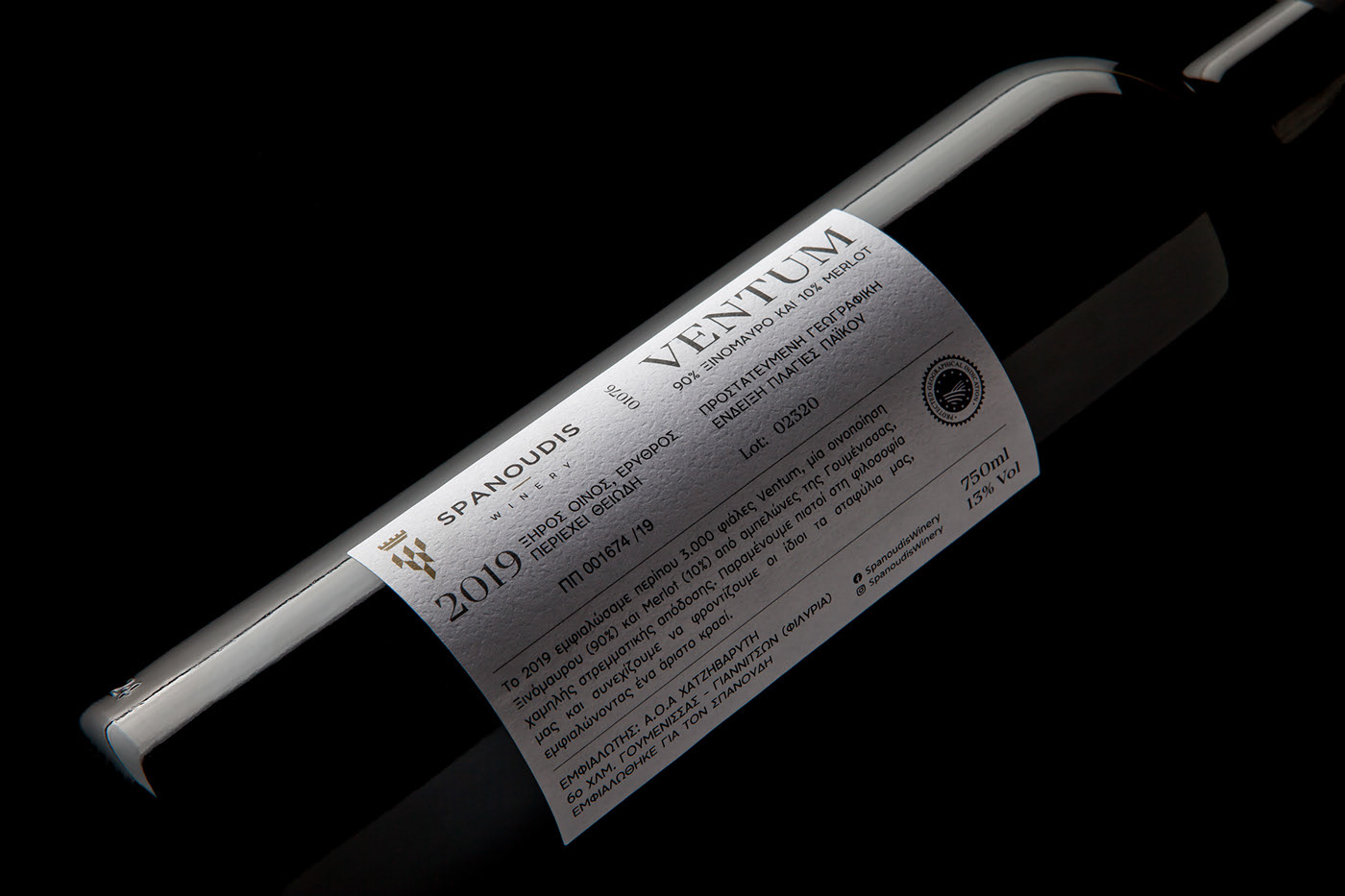
The haphazardness of the main V element is supported by a highly structural design grid that delivers the factual information about the wine. This creates a lovely counterpoint making the overall composition intriguing.

Designed by Cursor Design
Photography by Michael Koronis

Discuss this Project

Leave a Reply

This site uses Akismet to reduce spam. Learn how your comment data is processed.

The Forktales Podcast™: Interviews with restaurant industry leaders and visionaries

Restaurant and advertising industry headlines and thinking

Reviews of restaurant experiences from around the globe 

Reviews of our favorite design, business, & restaurant books

Our favorite typography and fonts

Inspiration in your inbox

Get the latest inspiration in your inbox every Monday morning, for FREE!

"*" indicates required fields

This field is for validation purposes and should be left unchanged.

Delicious Bits in your Inbox!

Get the latest and greatest content delivered to your inbox for free!

"*" indicates required fields

This field is for validation purposes and should be left unchanged.