
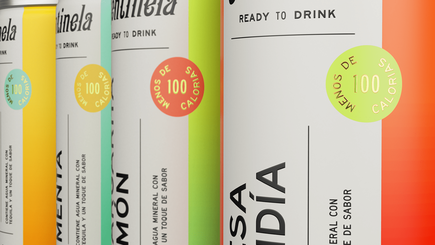
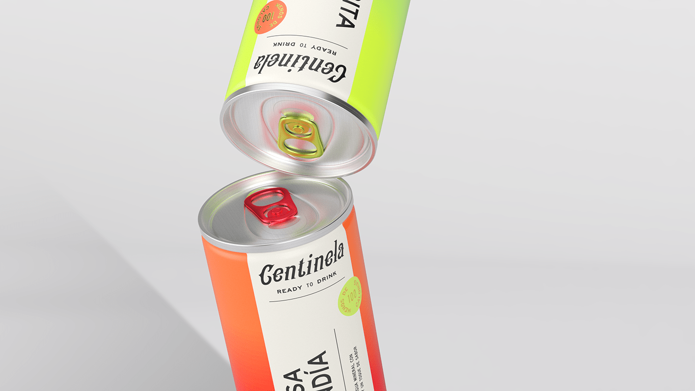
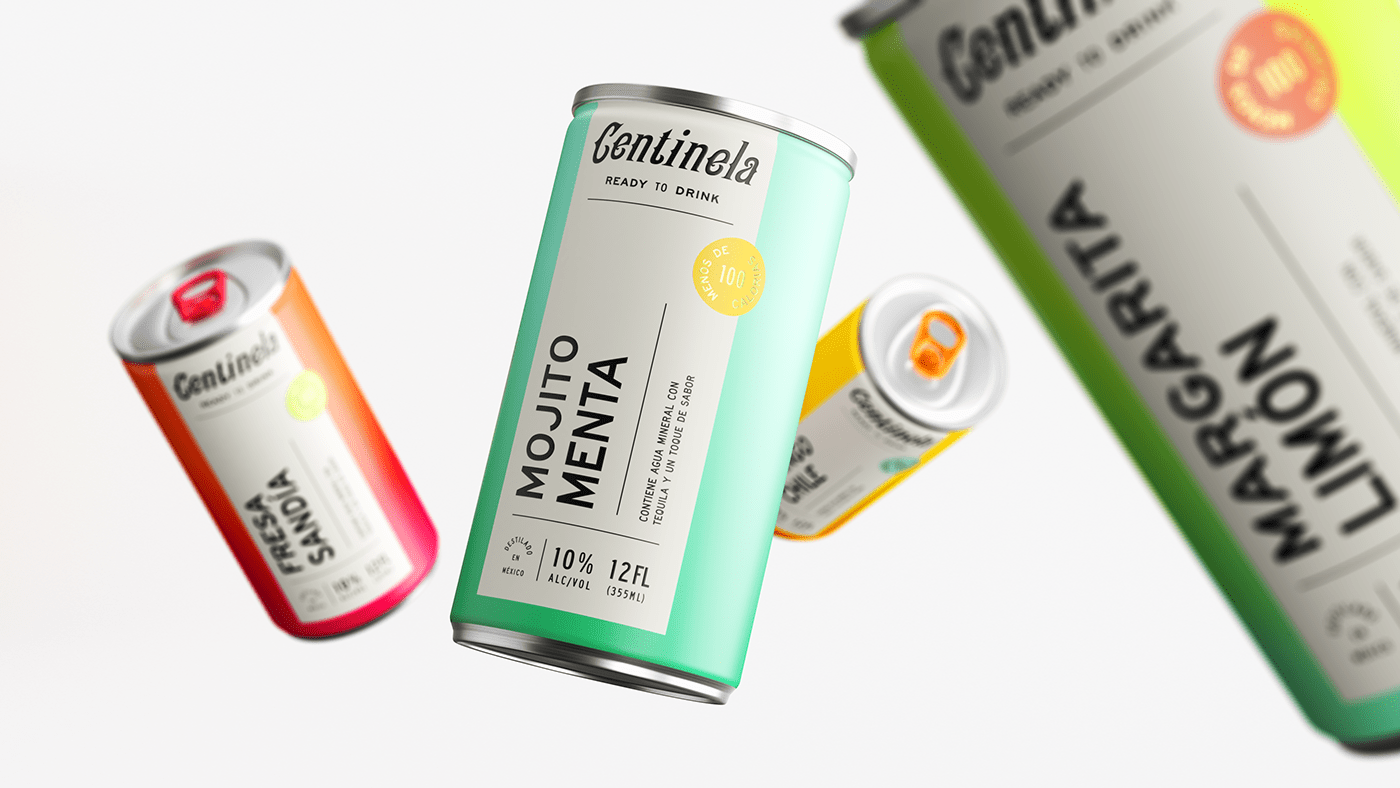
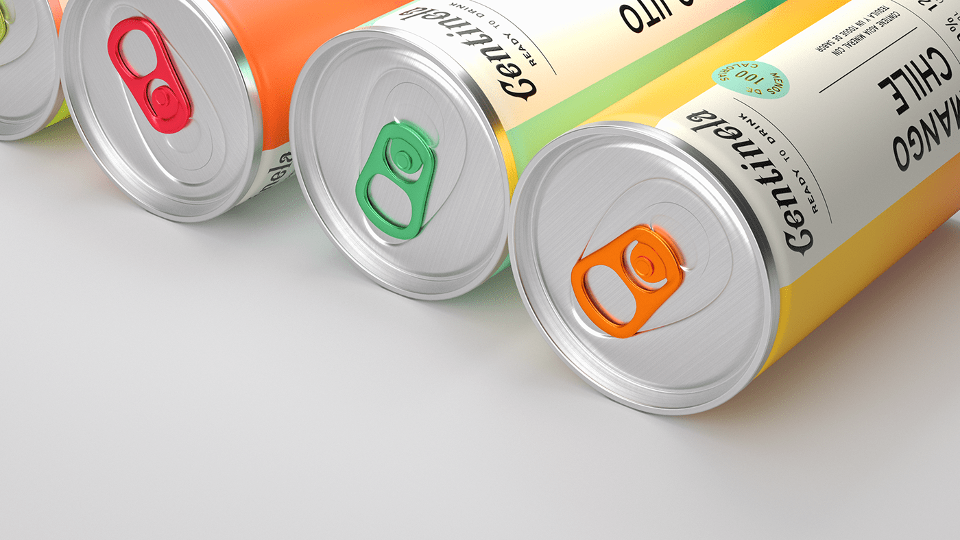
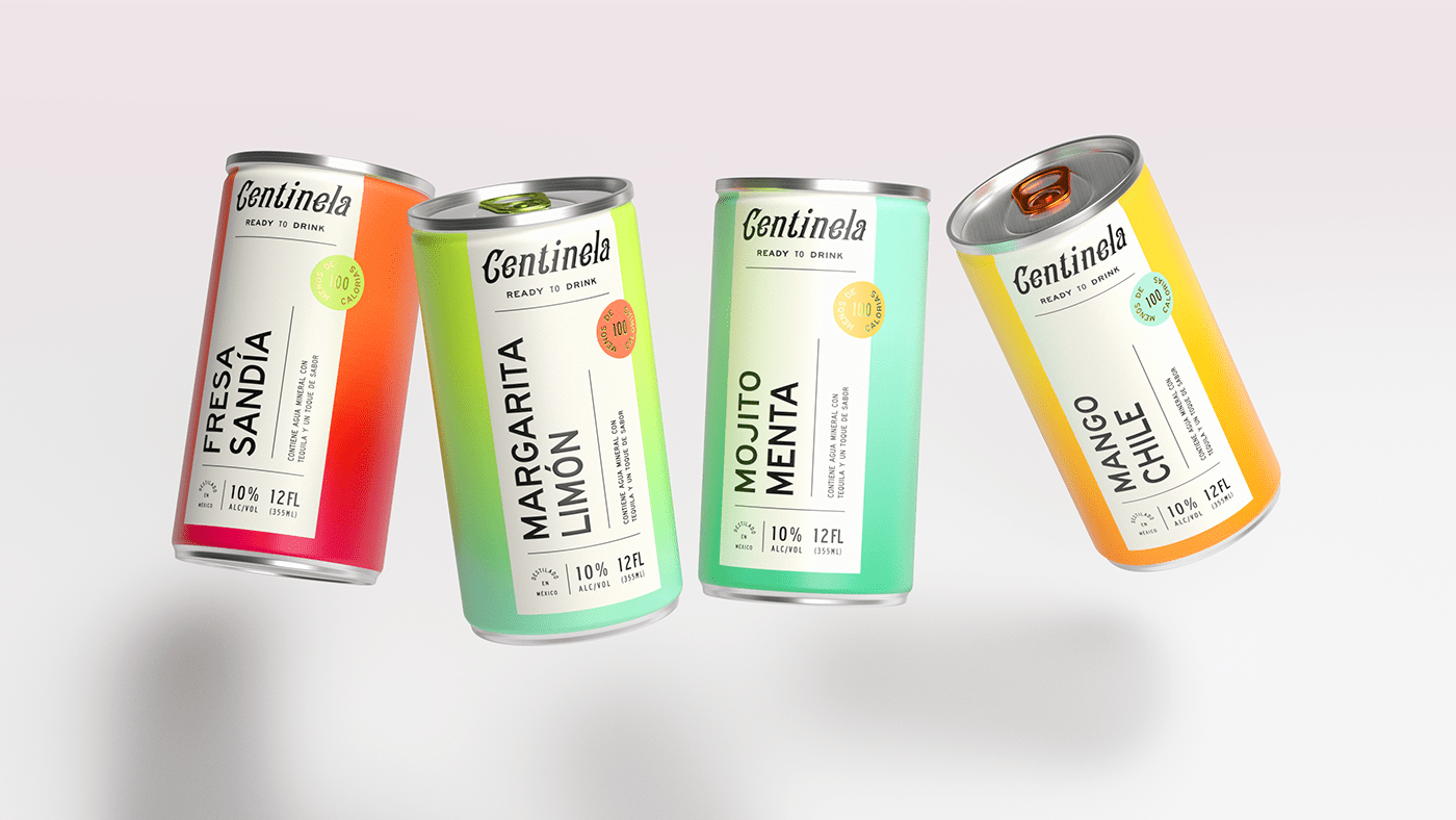
Maybe i’m just on a vibrant colors kick this week, but this project jumped out at me as too great to not share. The ombré gradient colors are energizing and a welcomed shift from the overly “craft” looks of late, especially for spirits. This brand demands attention and delivers a reward in its freshness of approach.
Although the core typography for the brand is a complete departure from the rest of the packaging direction, I actually don’t mind it. It’s a great dichotomy that puts emphasis on both aspects of the experience. And, of course, it would be a misstep to change the parent brand’s identity for just one product.
Here is how the folks at Human describe their direction: We created a packaging that took inspiration in a vintage bold layout that represents the heritage of the brand but with a twist in the color palette representing Mexico´s folklore and the vibrancy of the cocktail scene. The product speaks to a younger audience as an introduction to tequila and the spirits world, we developed an identity that could capture the new and exciting road the company is heading.
Designed by Human


