
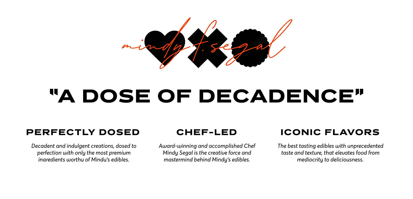
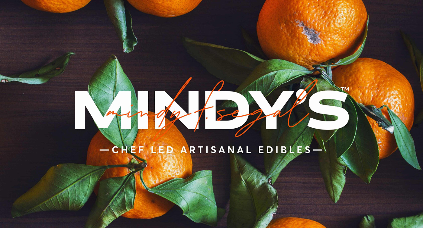
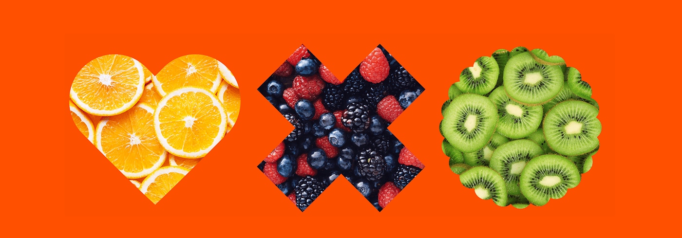
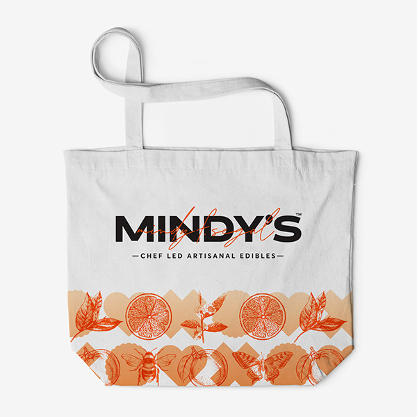
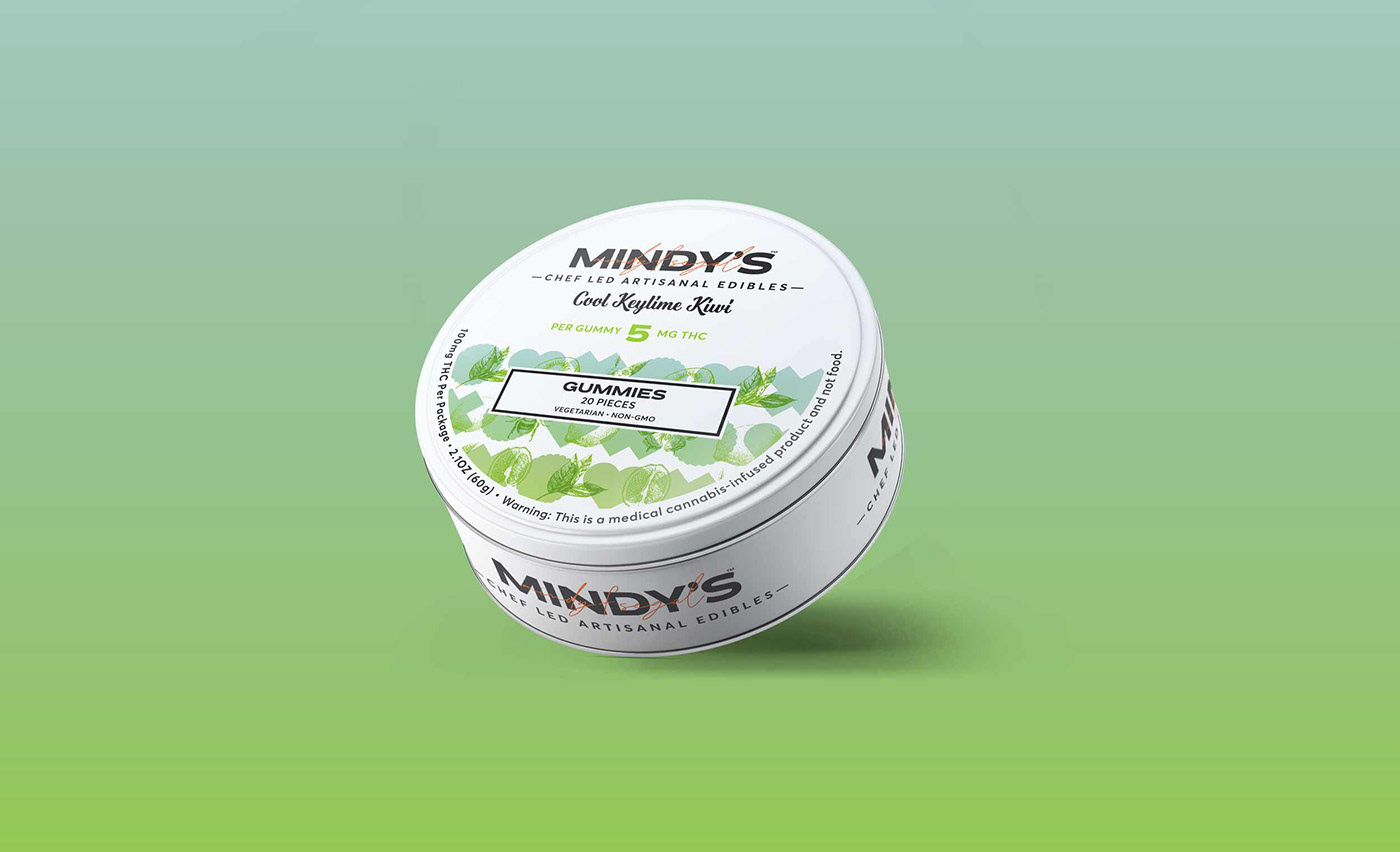
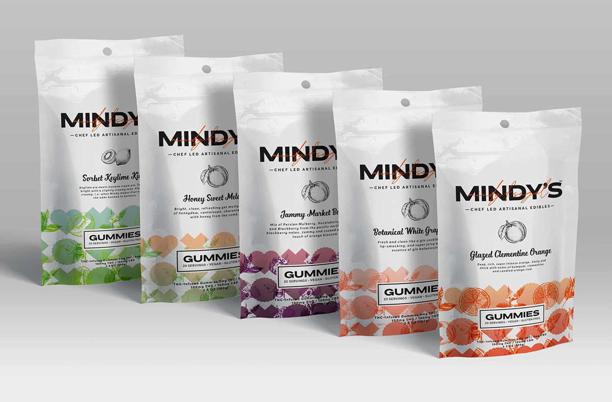
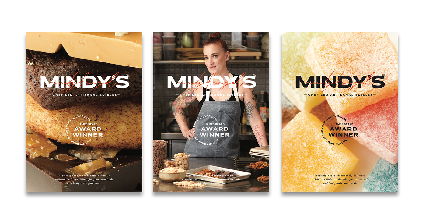
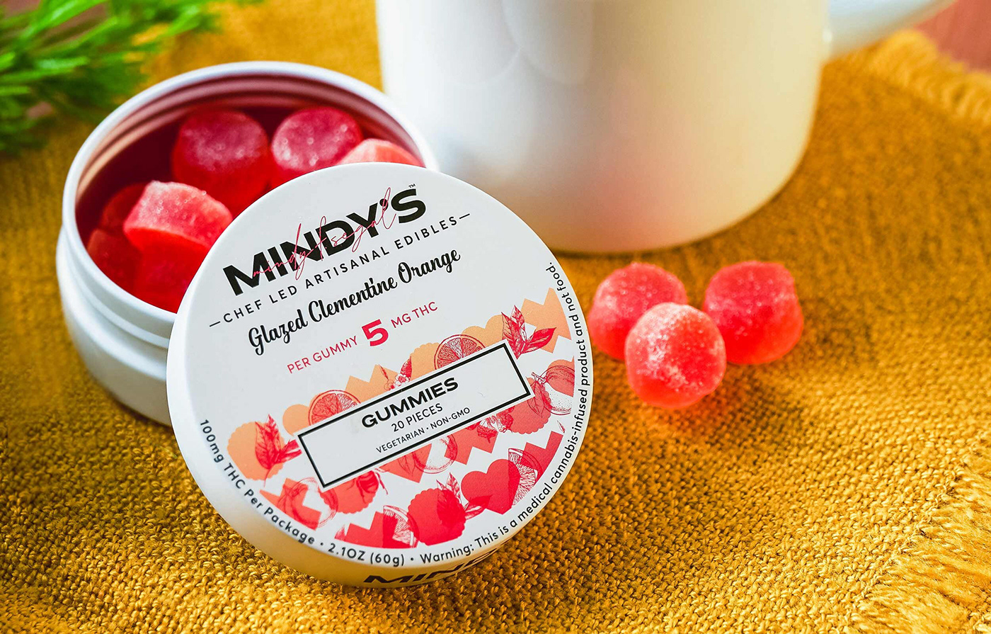
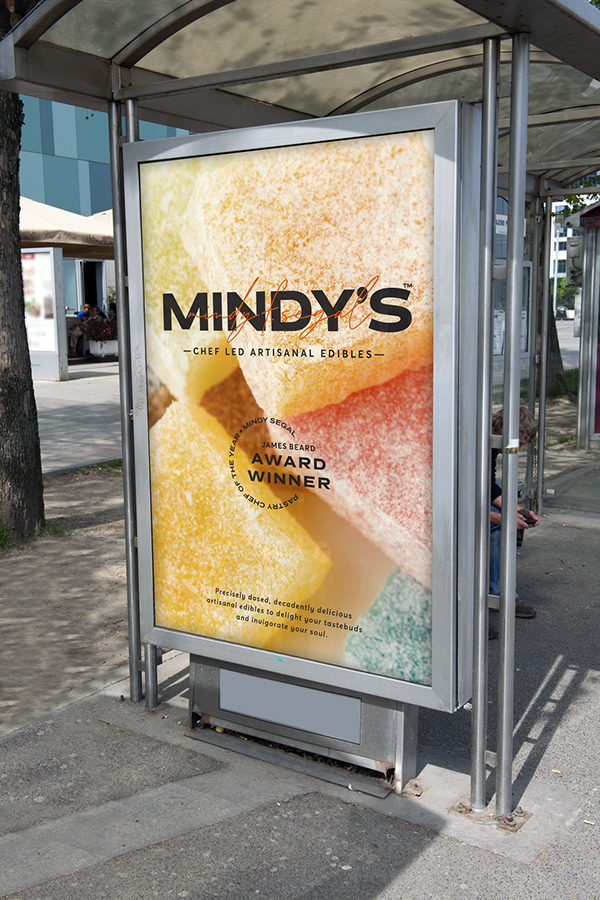
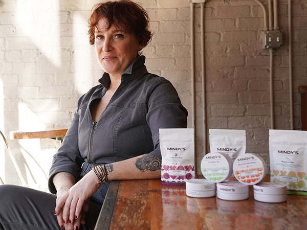
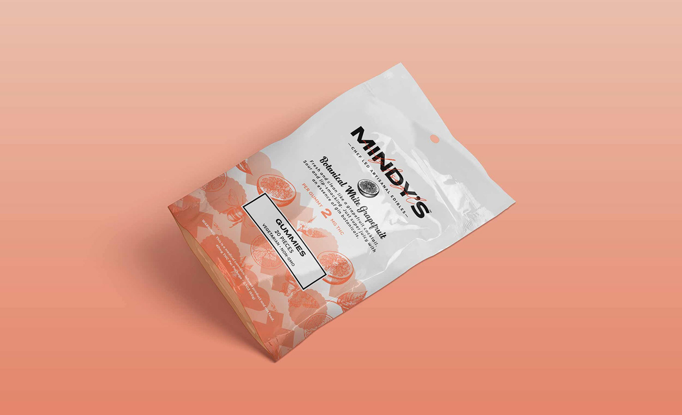
Designer Kristine Arth creates an amazing brand identity and packaging suite for this product line from James Beard Award-winning chef, Mindy F. Segal. The identity is an exercise in opposing typography that somehow marry together quite nicely. This marriage of opposites plays out throughout the identity system from typography through imagery that combines classic illustrations with simple, bold iconography.
Designer Kristine Arth explains the inspiration: “While Mindy herself is bold and unapologetic, her cooking is much sweeter, much more careful and comforting. For this line of highly artisanal edibles, the branding had to showcase this duality. Bold patterns are juxtaposed with hand-illustrated heritage-style icons (cute fruits and insects mixed with skulls and armadillos, contrast in itself). The wordmark itself expresses this duality, with its thick lettering inscribed with a handwritten signature.”
The duality creates a fantastic visual experience that elevates past the clichés associated with the cannabis world. It creates a flavor that can almost be tasted just by viewing the products.
Designed by Kristine Arth


