
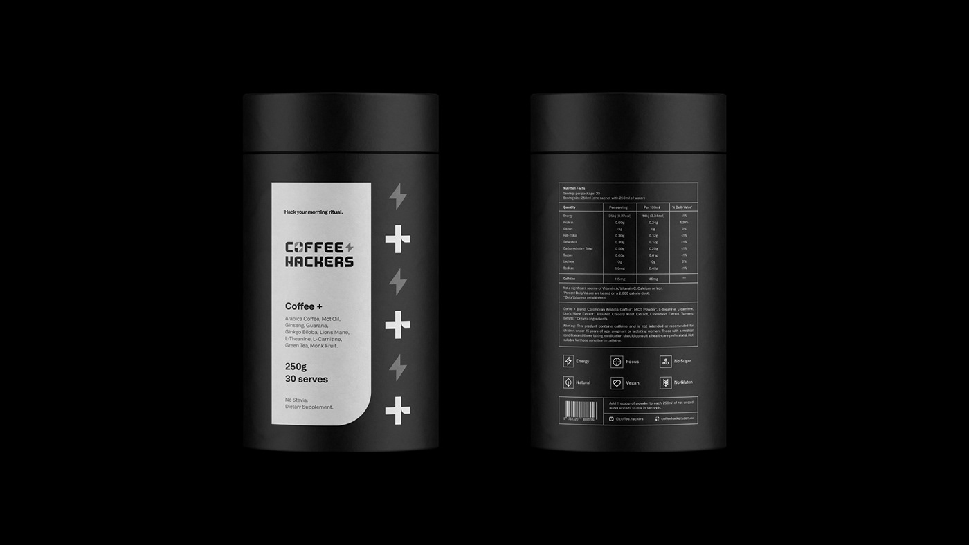
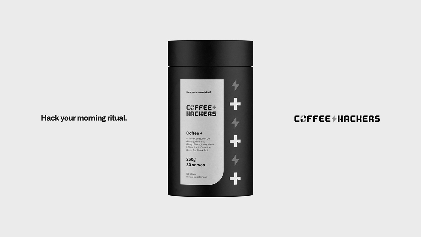
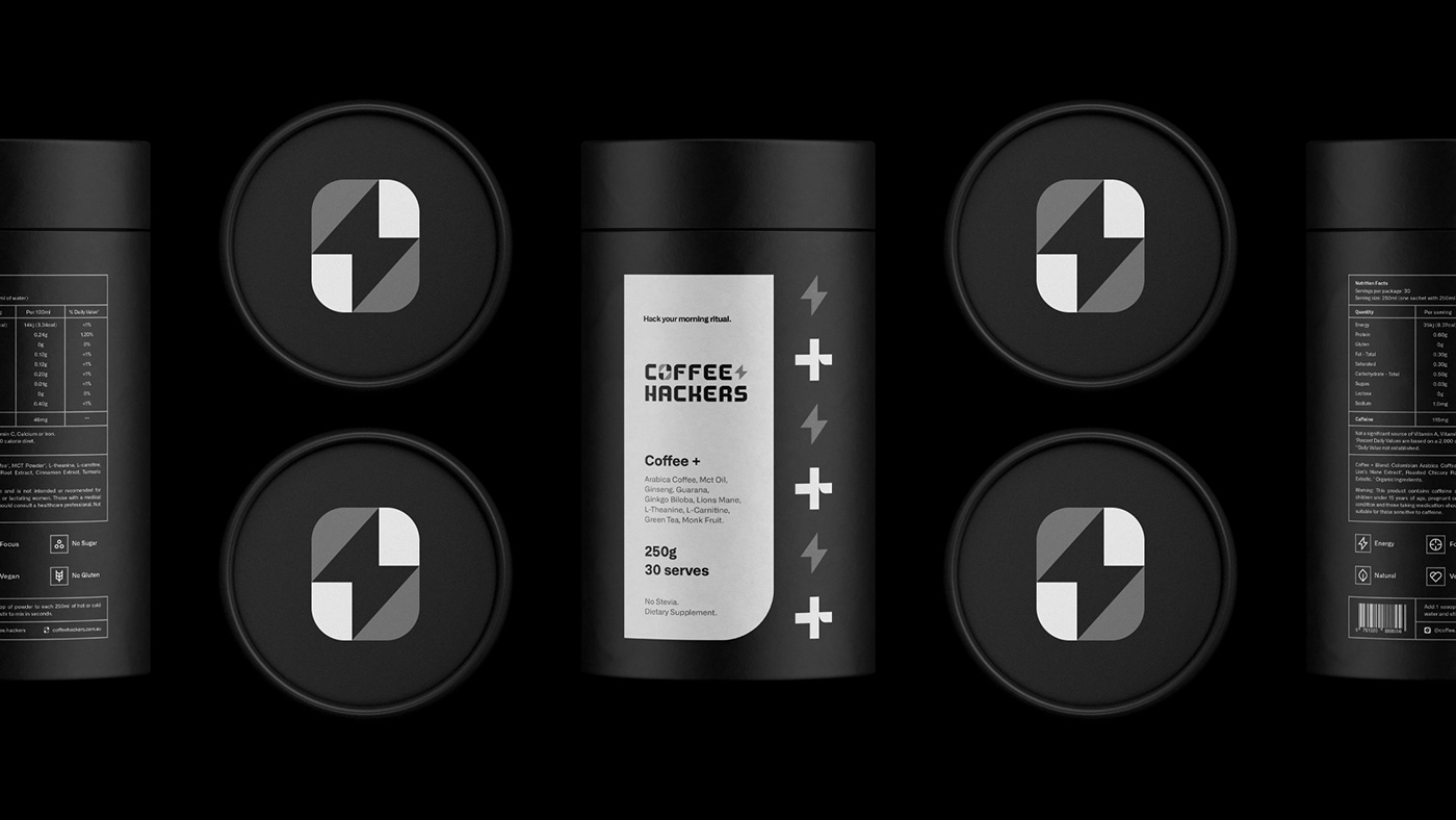
Coffee Hackers seeks to attract the fitness-minded individuals who tackle each day with energy and vigor. “[They] created a natural soluble energy drink with a reduction in the harmful part of caffeine, with the addition of organic products that enhance the user’s taste and performance in their exercises. Most young Australians have a problem related to caffeine, so the product has these characteristics, which are reflected in a minimalist, modern and clean visual identity,” stated Vissotto on his portfolio website.
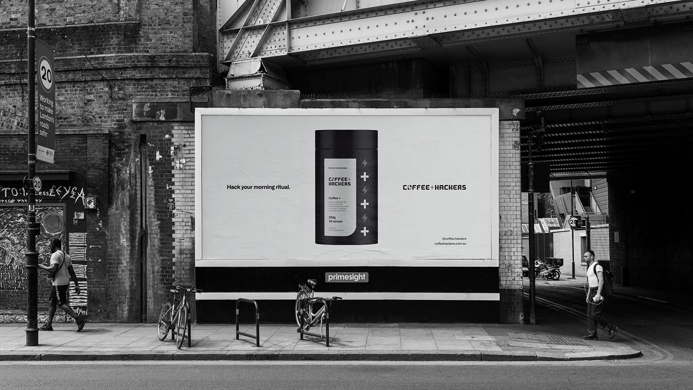
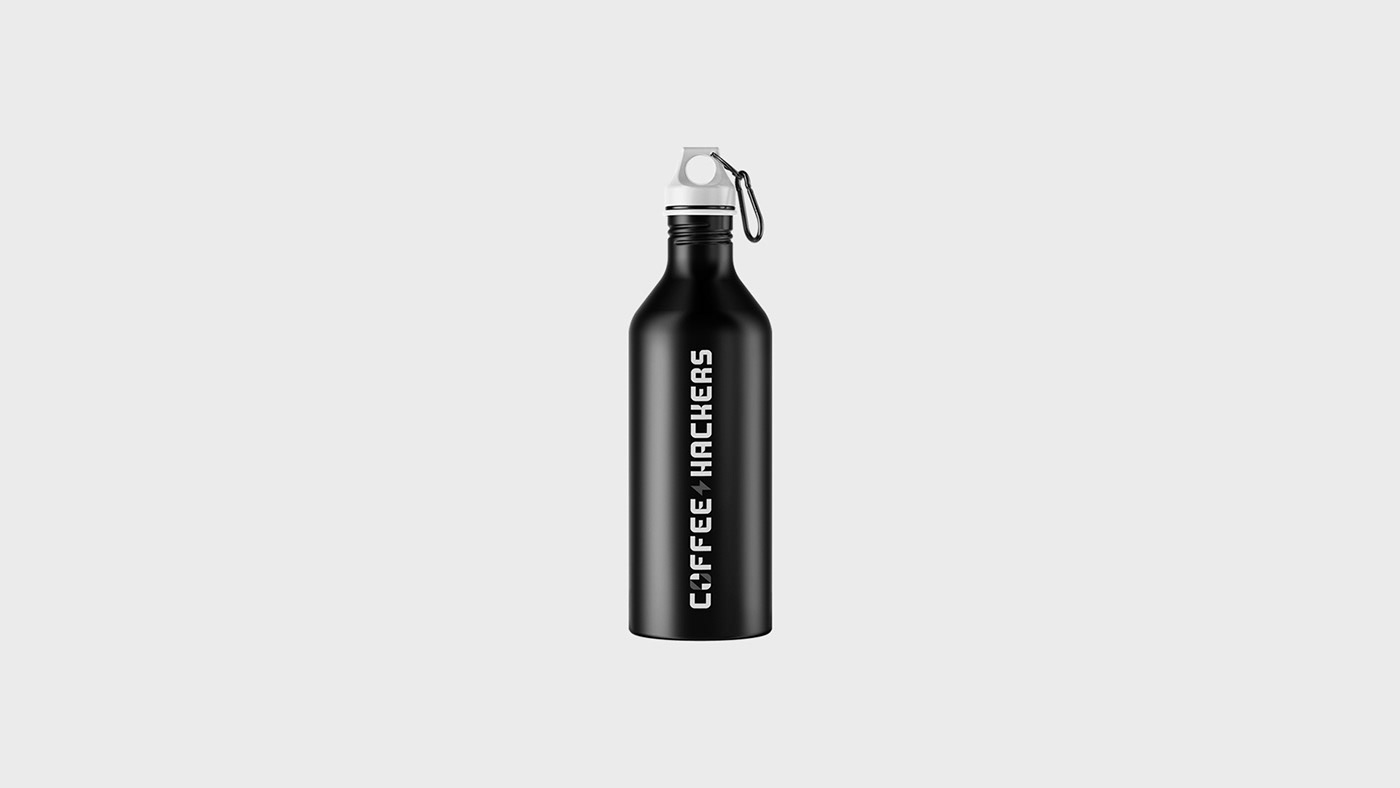
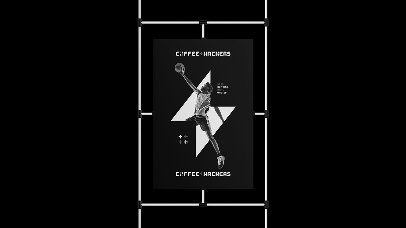
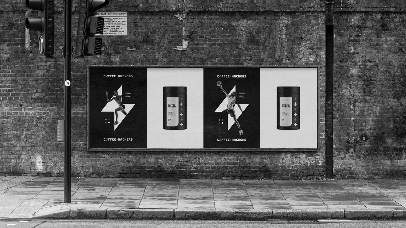
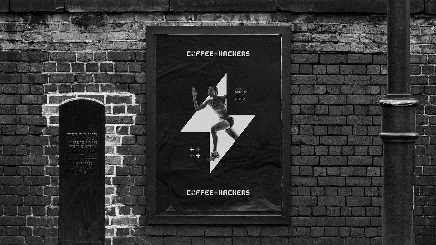
The brand was designed to evoke this energy through a direct, minimalist approach where meaning is profoundly and confidently woven throughout the visual language. Subtle icons like a lightning bolt and plus sign portray energy and increases in gains, goals, and so on.
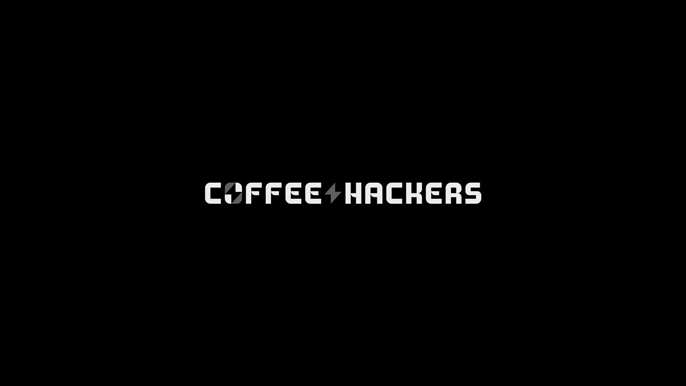
This work is exemplary of how even black and white, limited color palettes can speak volumes and tell a story. By breaking the grid on the poster work, Vissotto adds a sense of motion and depth while reinforcing the message of energy. Even the nuances of the brand’s typography seem to insinuate a sense of “hacking” and motion.
Designed by Guilherme Vissotto


