
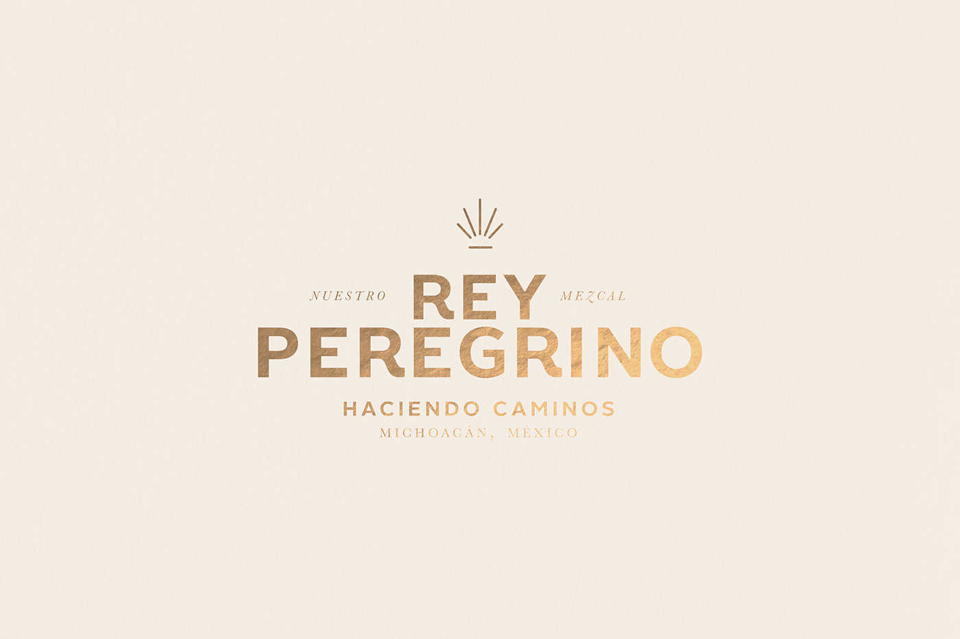
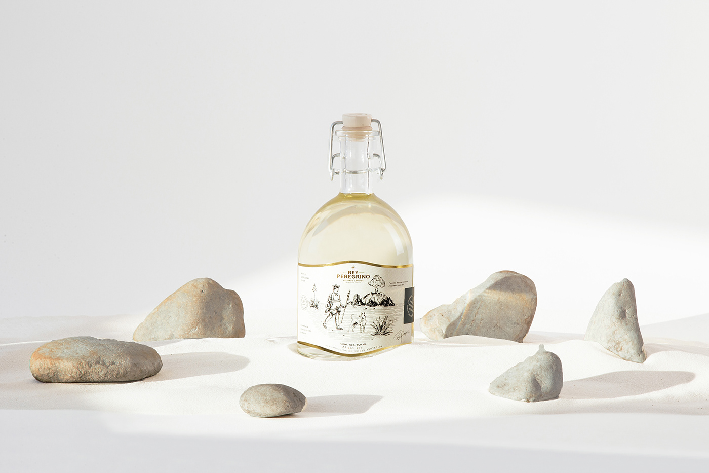
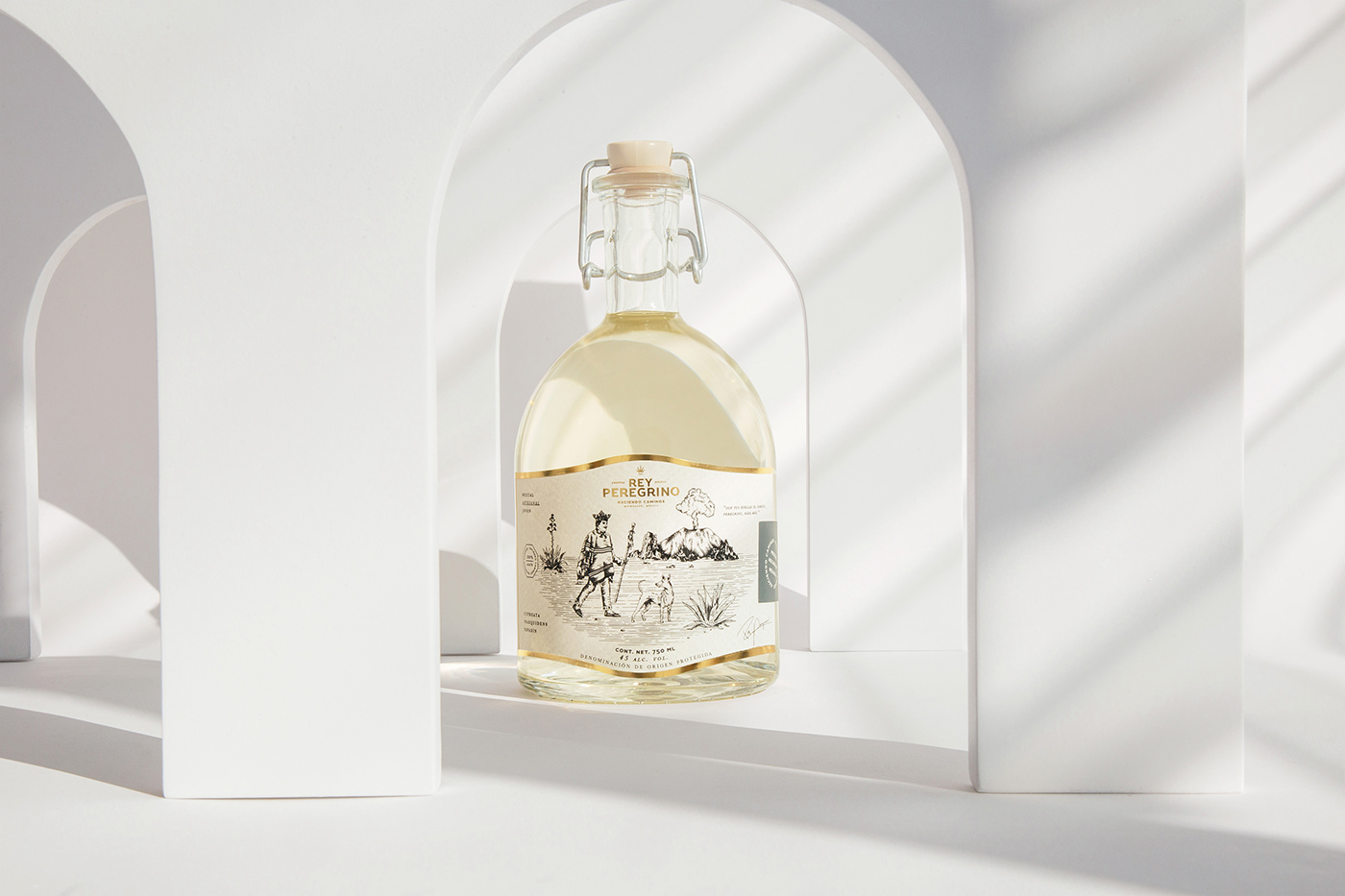
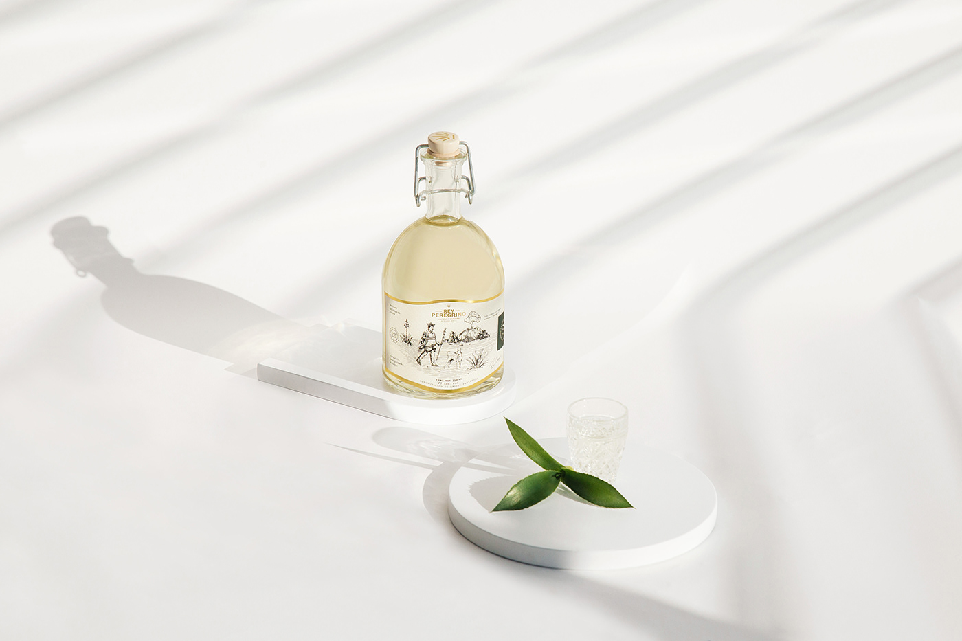
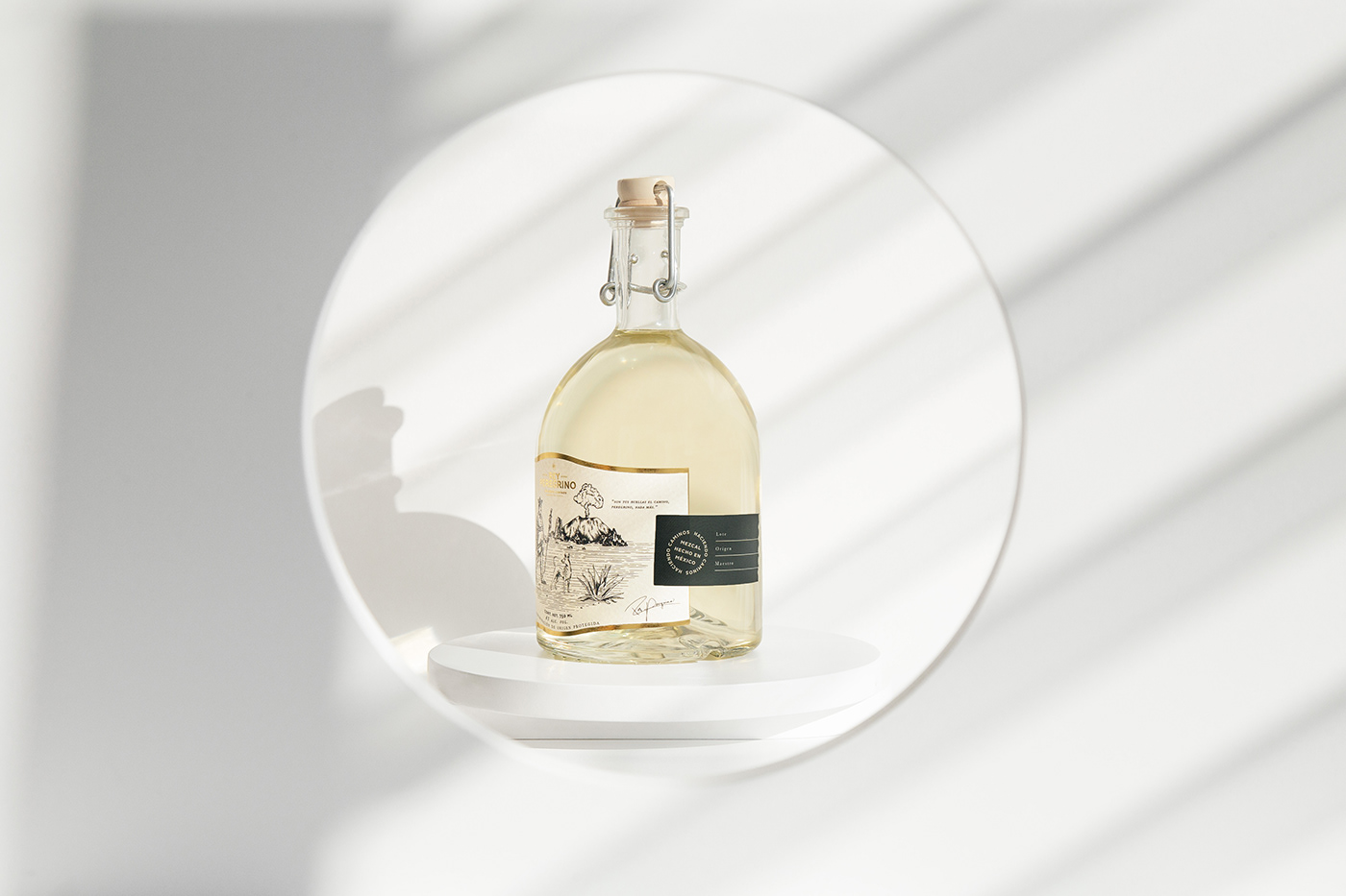
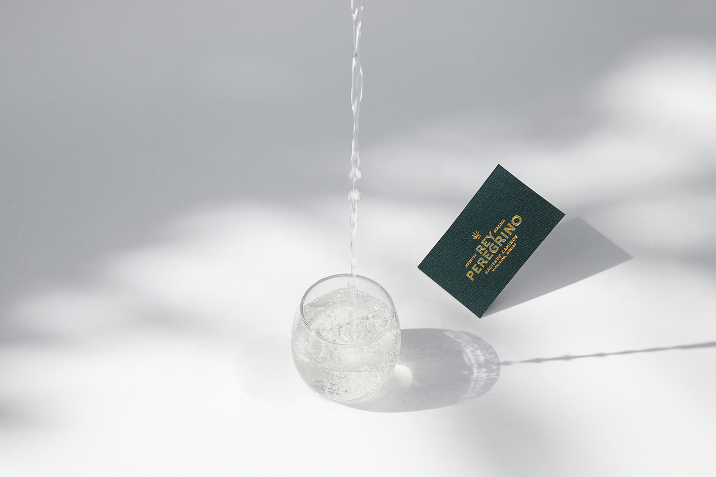
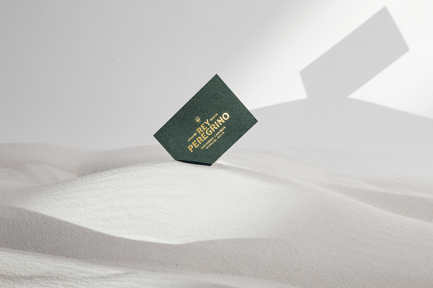
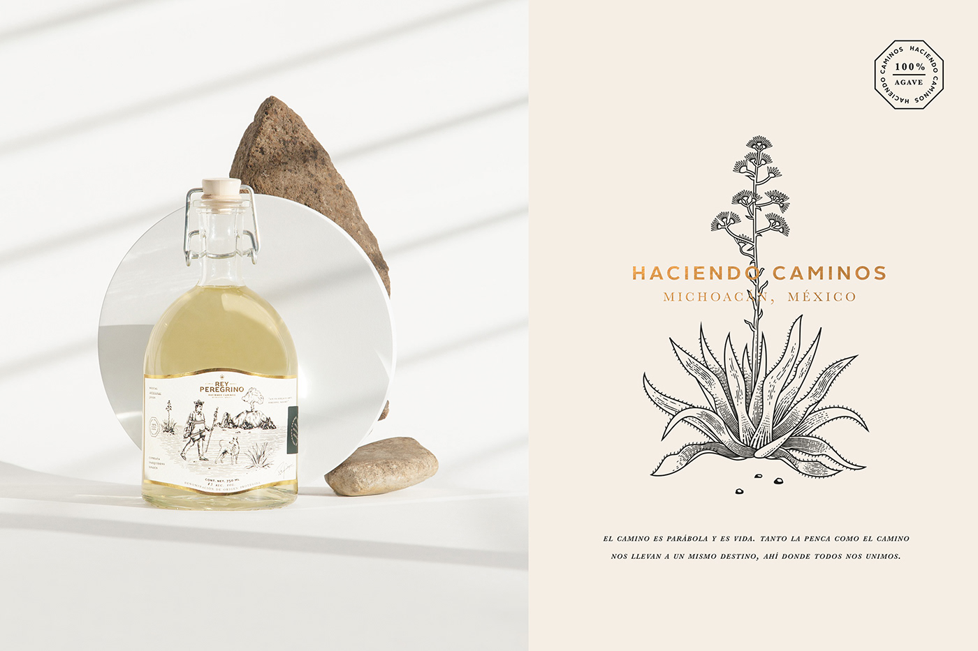
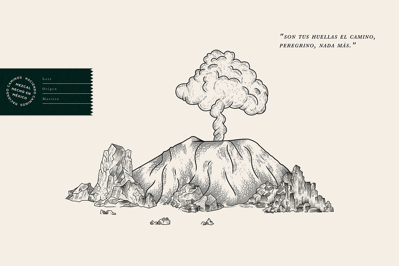
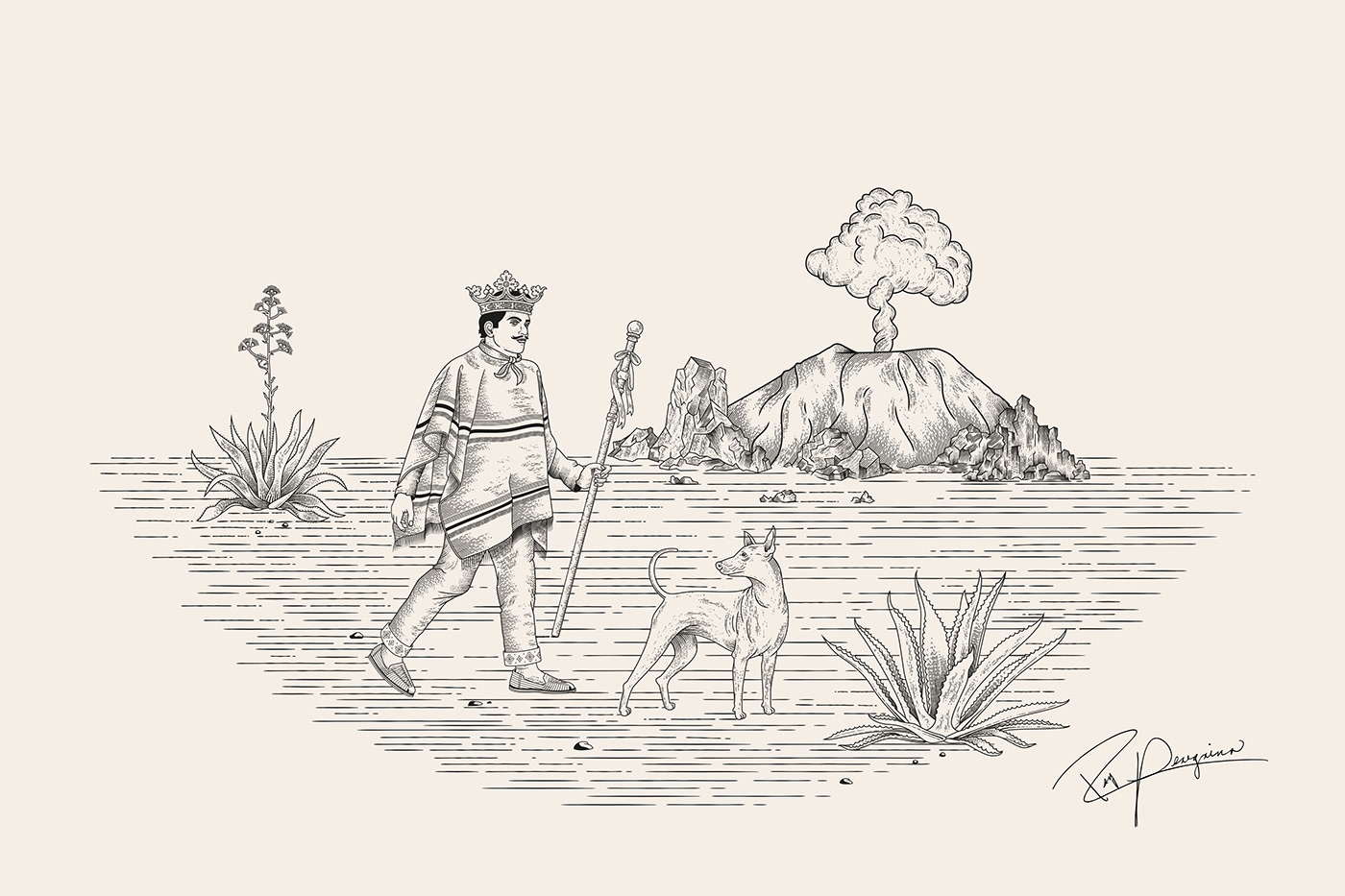
The spirits industry easily falls into a rut of sameness. The heavy-handed approach to establishing craft and a sense of heritage, even for a brand new brand, permeates the brandscape. While the packaging work for Rey Peregrino doesn’t full step away from it, it does establish a fresh look for mezcal that is notable.
Yes, the brand identity and package design do feature some go-to looks for spirits brands–woodcut illustrations, serif typography–but it delivers it in a modern way with clean whitespace and confidence found with some breathing room in a composition.
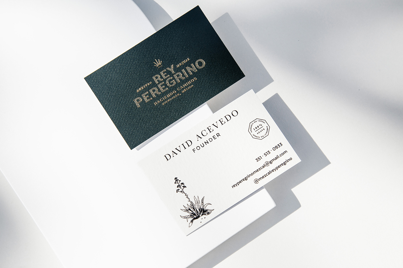
The most notable element of modernity is the simplified, minimized agave mark. Comprised of just six lines, the mark is wonderfully simple in all the right ways.
Designed by Further Co.


