Side X Slab Town Branding by low key Design

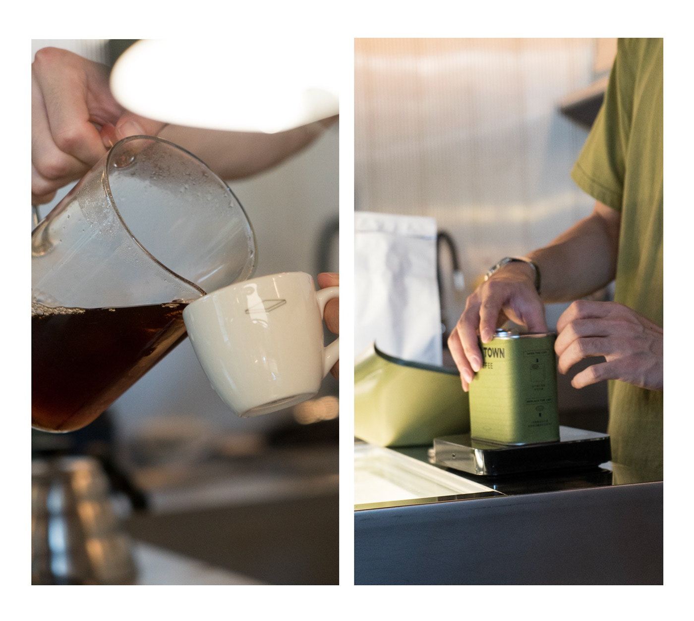
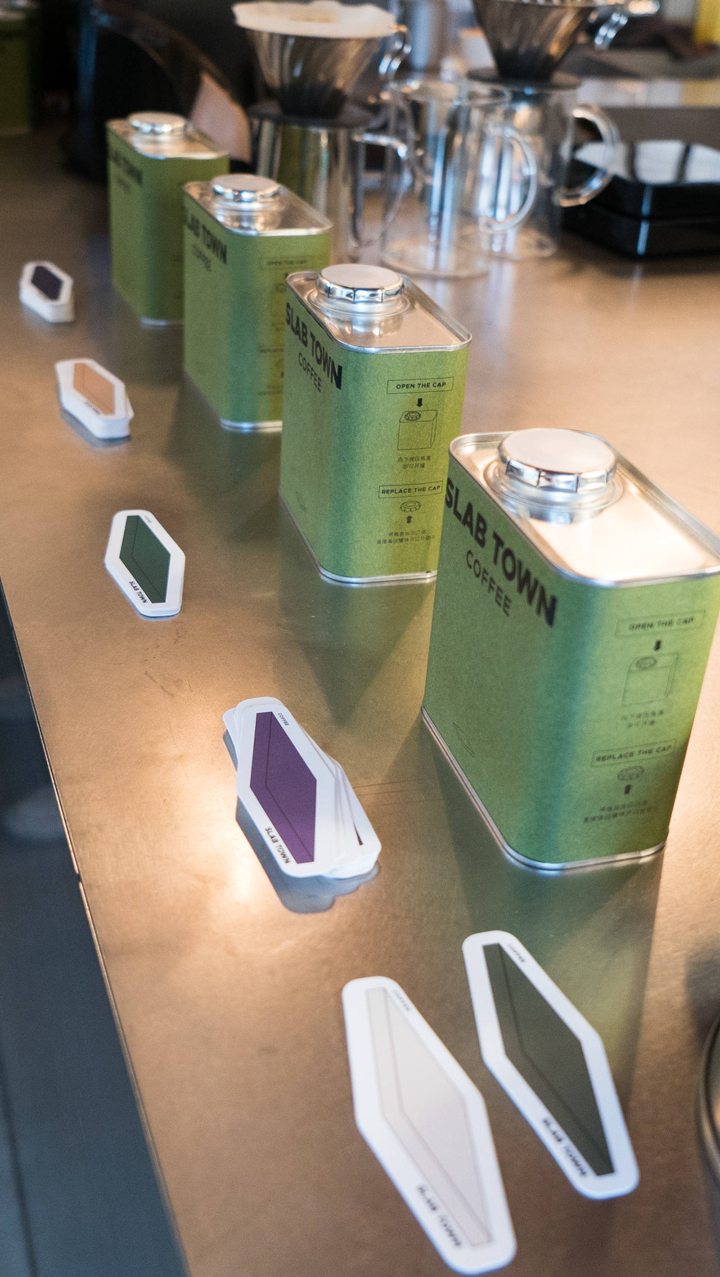
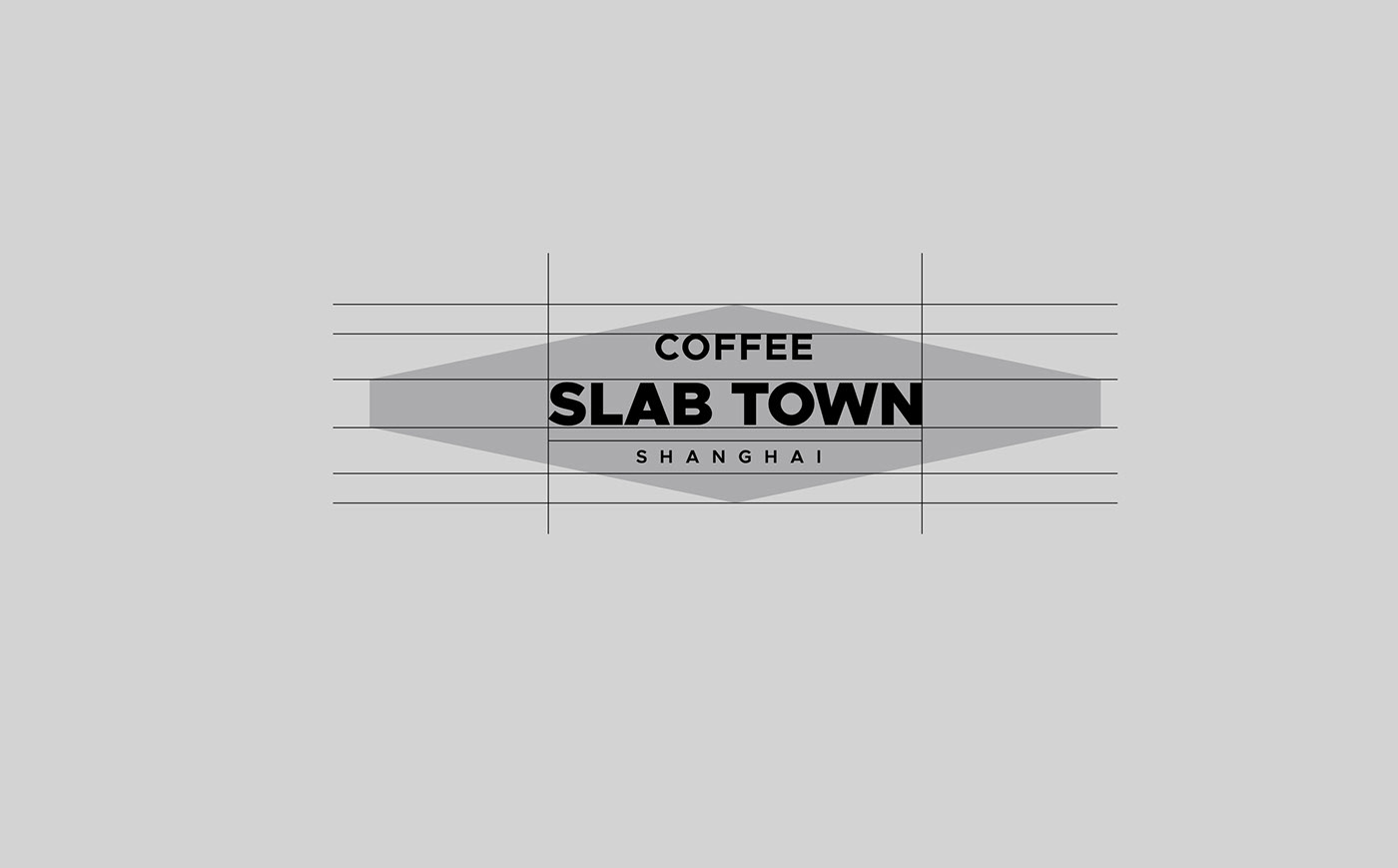
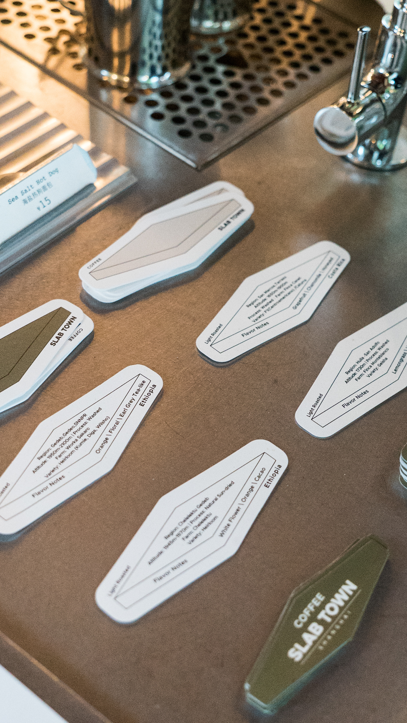
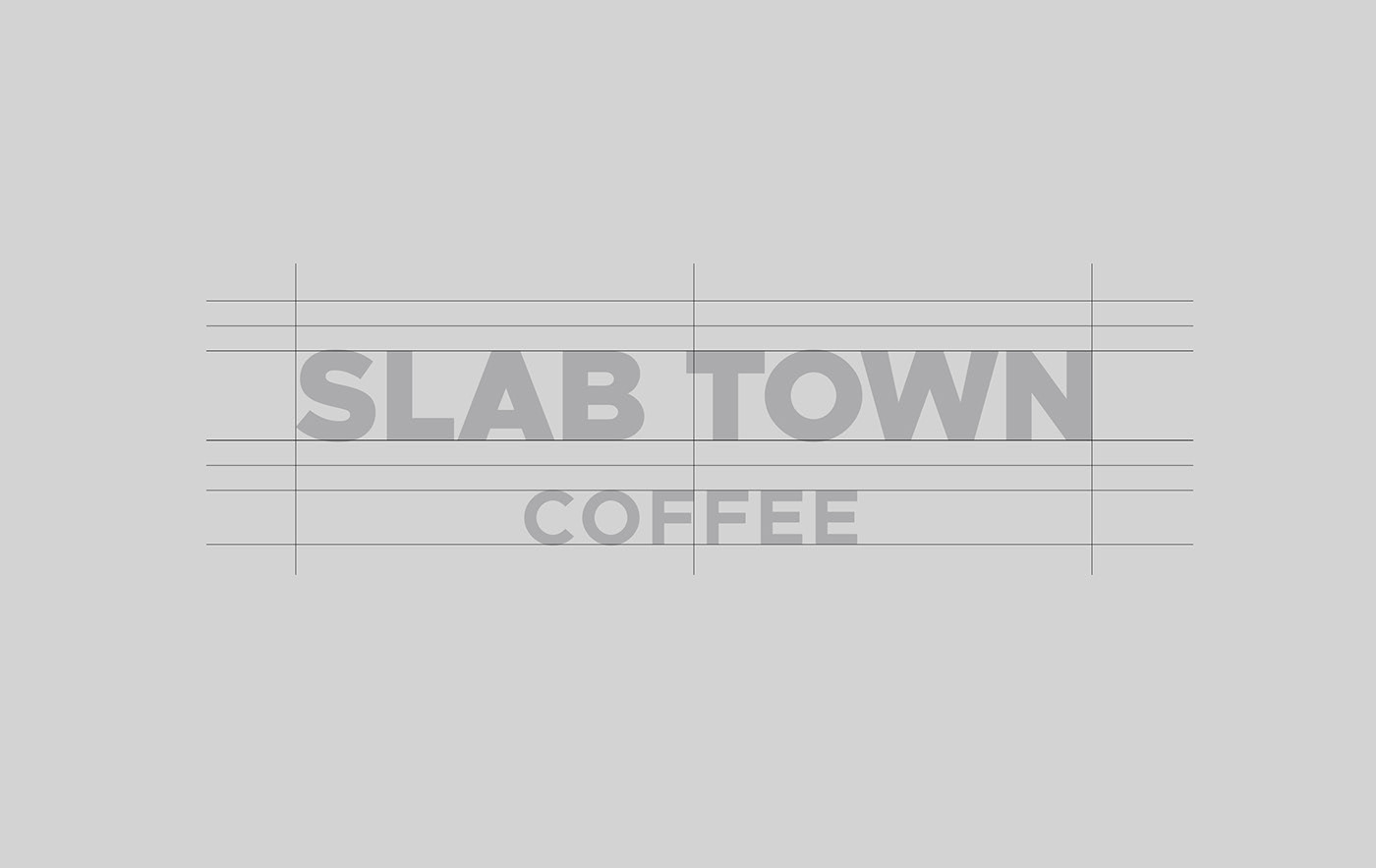
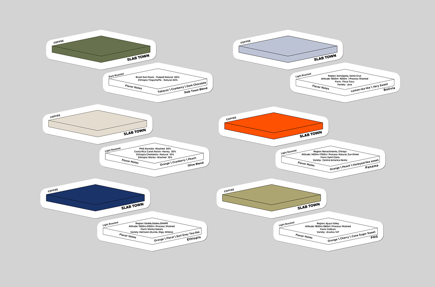
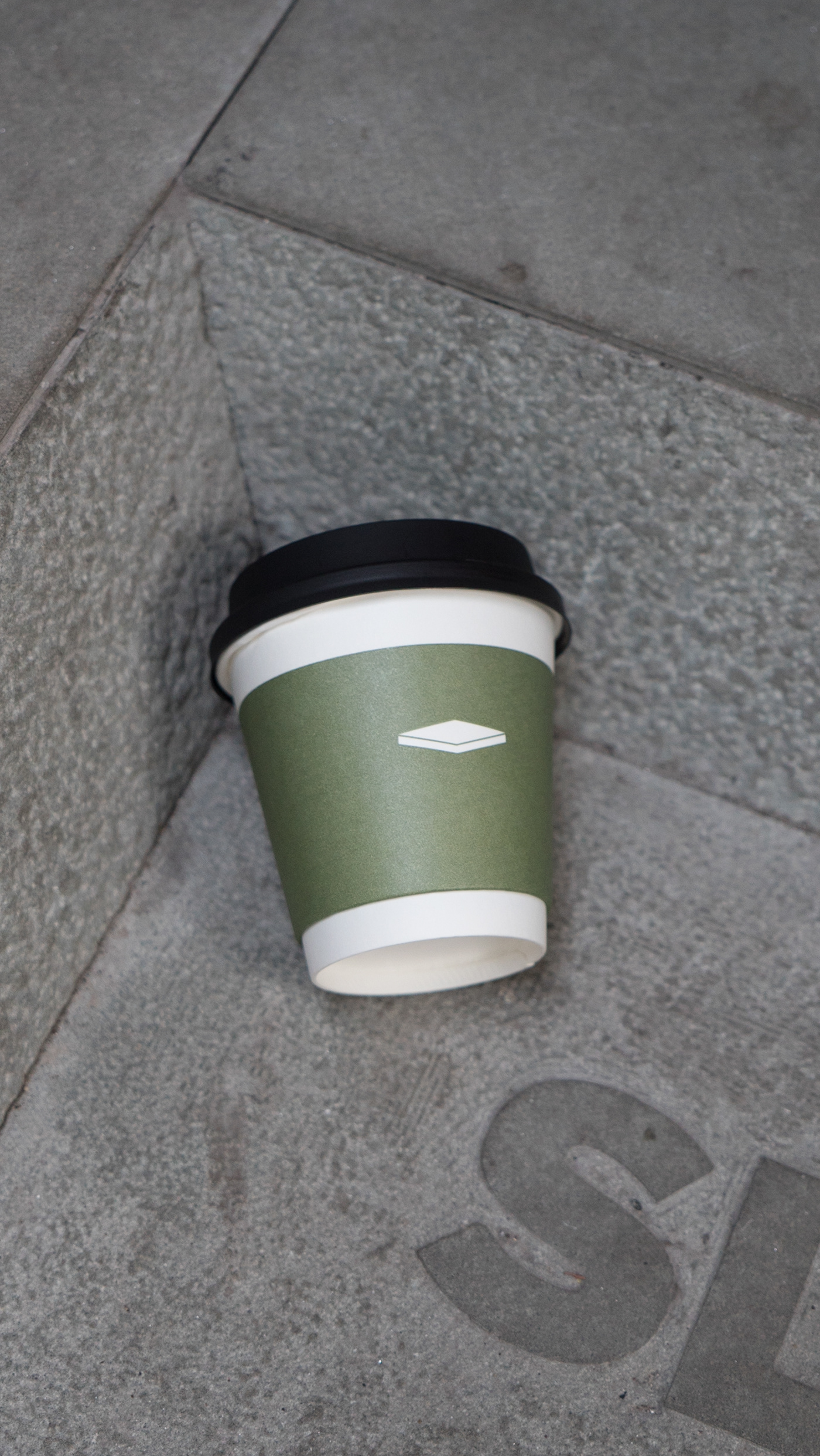
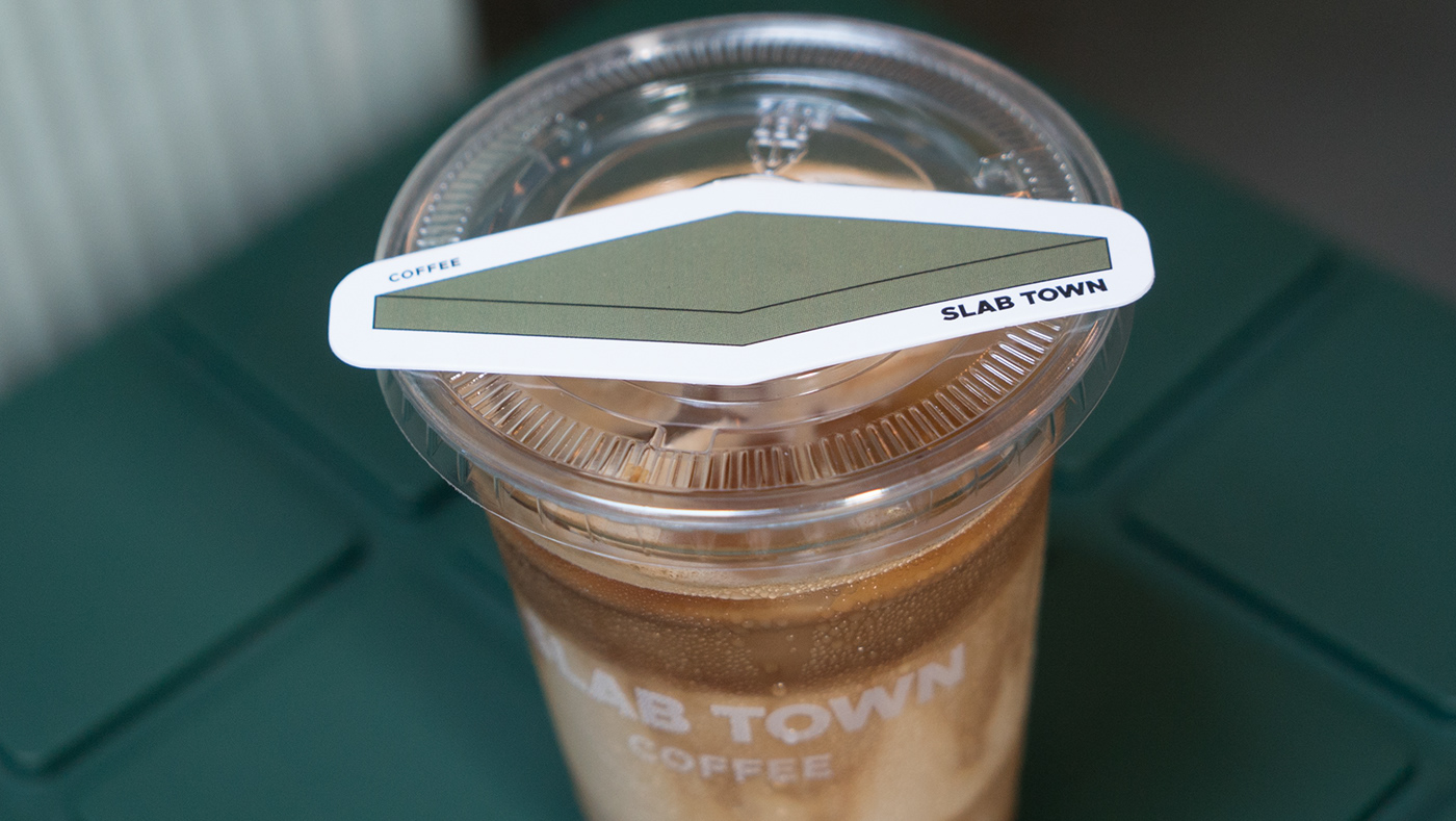
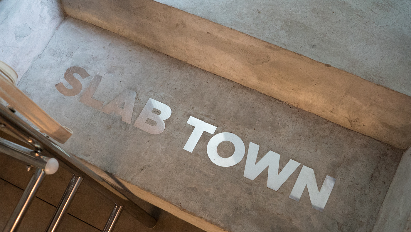
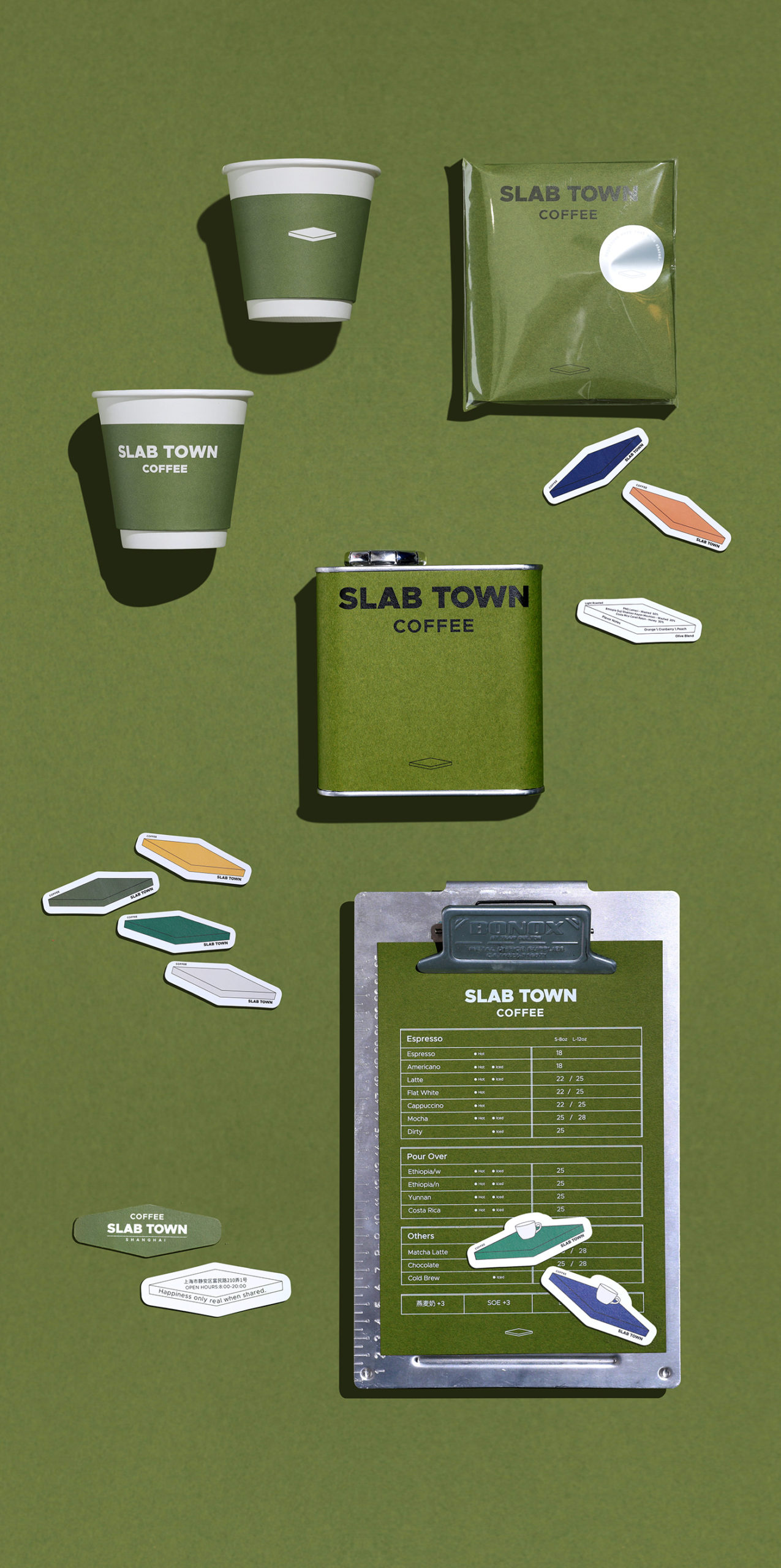
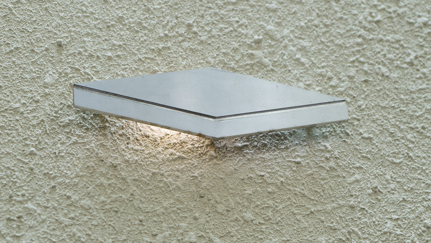
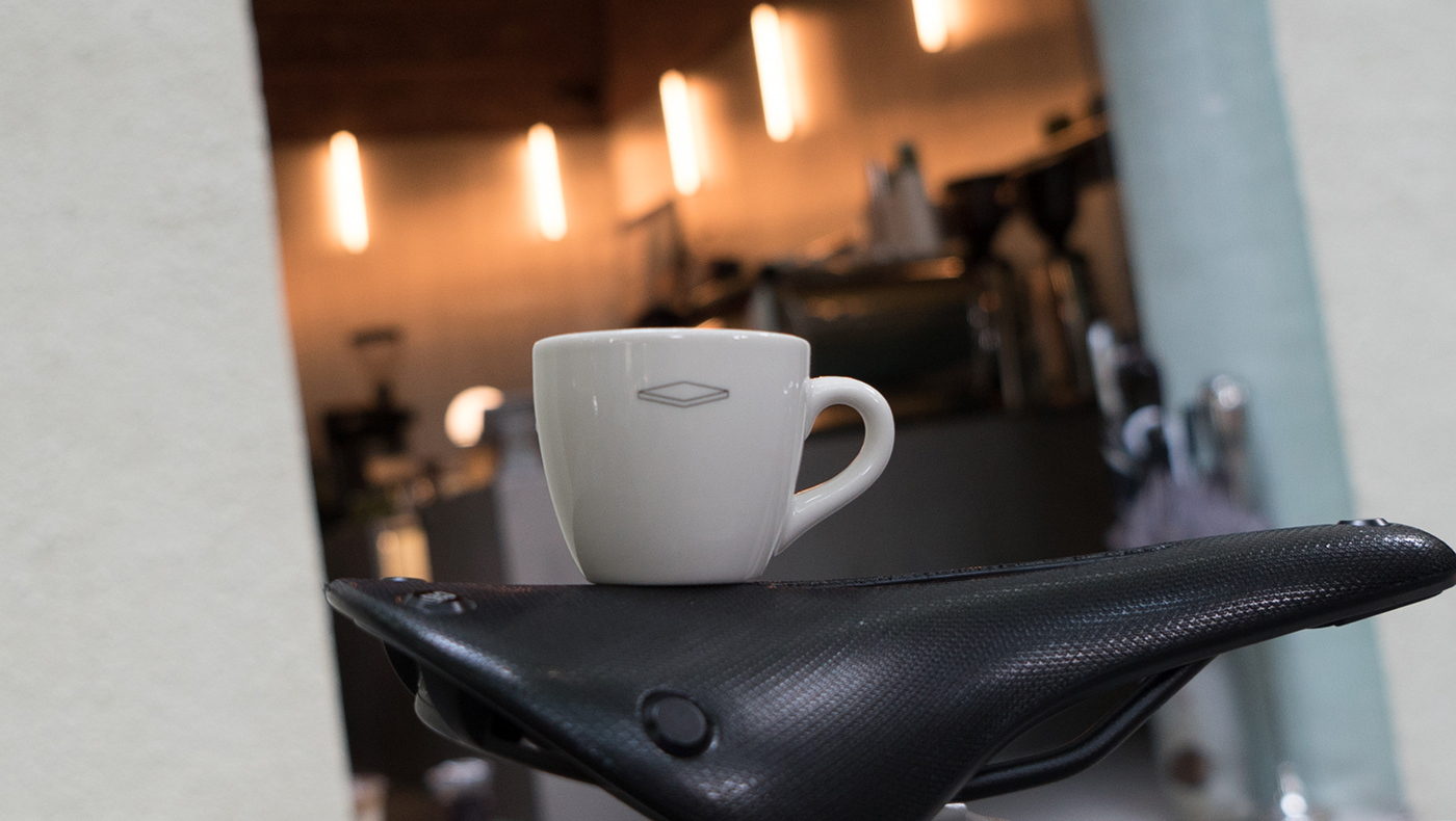
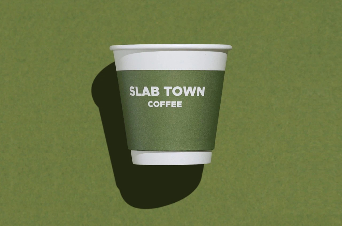
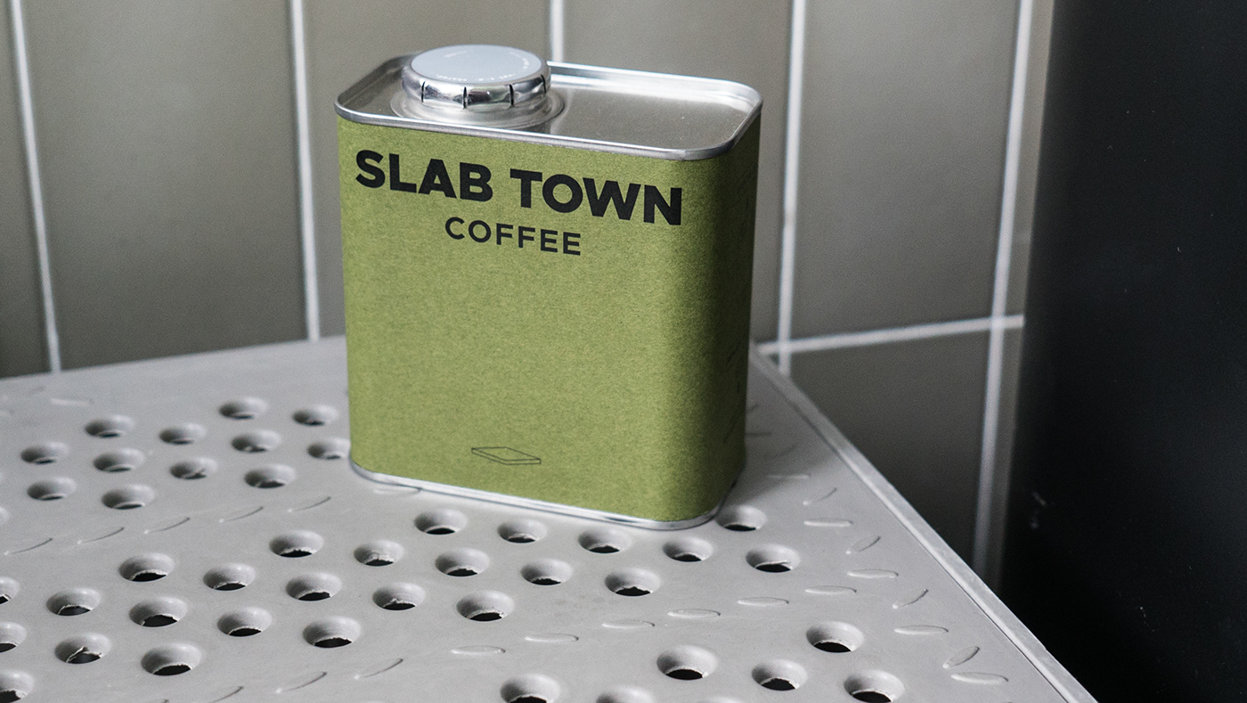
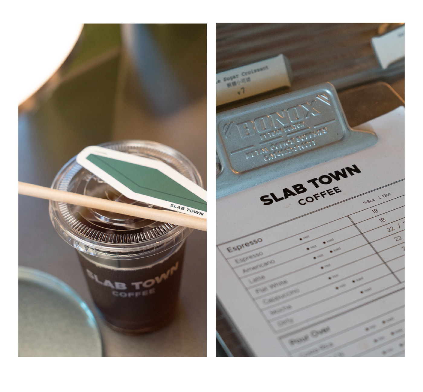
We love when brands understand the great power of simplicity and minimalism, especially because doing it well is a challenge. Slab Town is one of those rare gems out there. Inspired by Slab City in the movie Into the Wild, this brand stands for a place of freedom, of things found, discovery, and reflection. For the logo, a simple bold san-serif typeface was used supported by an isometric rectangle that represents a literal slab. Slab Town’s brand identity feels retro, simple, mysterious, and inviting.

Slab Town Branding by low key Design.

=

Discuss this Project

Leave a Reply

This site uses Akismet to reduce spam. Learn how your comment data is processed.

The Forktales Podcast™: Interviews with restaurant industry leaders and visionaries

Restaurant and advertising industry headlines and thinking

Reviews of restaurant experiences from around the globe 

Reviews of our favorite design, business, & restaurant books

Our favorite typography and fonts

Inspiration in your inbox

Get the latest inspiration in your inbox every Monday morning, for FREE!

"*" indicates required fields

This field is for validation purposes and should be left unchanged.

Delicious Bits in your Inbox!

Get the latest and greatest content delivered to your inbox for free!

"*" indicates required fields

This field is for validation purposes and should be left unchanged.