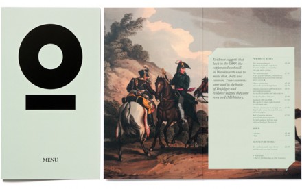
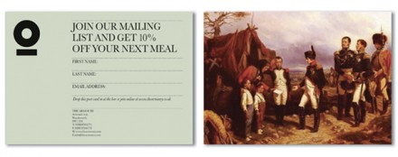
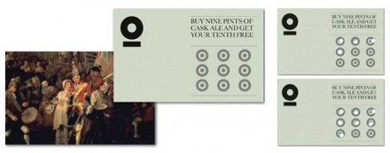
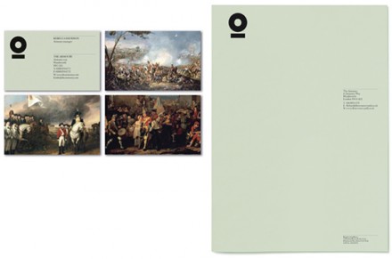
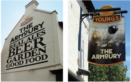
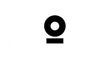
The Armoury, a bar located in South London, has the branding identity to match its surroundings, which is a prominent theme we’ve seen in the past from British branding outfits. In this case, The Armoury wraps its arms around its war-time heritage and gets branding from Purpose that is heavily influenced by guns, war and steel. The logo mark itself as well as the typeface used in the word logo takes influence from the heavy machinery and cannons of the early British Navy. The black color scheme for the typeface works well and the same characteristics are applied to the logo mark, a circle and bar combo that resembles a cannon. Images from old Britain accompany much of the work and it creates an old-fashioned feel with honor to the past, but a with a light-hearted modern feel that doesn’t take itself too terribly seriously. The paintings collide with the heavy modern trademark well creating the balance the bar was looking for.